

MongoDB Charts
Create MongoDB Charts with DronaHQ
DronaHQ offers ready-to-use charts UI control and a straightforward and intuitive interface for visualizing data in a table or column format. DronaHQ’s chart component is powered by Plotly empowering developers to build complex MongoDB chart visualizations using Plotly’s JSON schema format. It allows users to integrate into their existing data sources enabling full customization using the Plotly.js library for custom and complex charts. DronaHQ’s modern data visualisation tools also allow users to get real-time business intelligence and insights with embedded analytics.
Benefits of having charts for Mongodb
Data is a vital element in determining the movement, communication and performance of a company. There is growing pressure to manage these data efficiently, but with growing data volumes every day, it is a challenge for teams to be data-driven in the truest sense.
One of the most efficient ways to manage and make sense of large data sets is data visualization. Captivating visual elements like charts, graphs, maps, lists etc make data easier to consume and understand. This enables teams to make better decisions by finding meaningful patterns and insights which otherwise they might miss.
Real-time business insights in minutes
Users can create multiple charts in a few clicks with easy-to-use dashboard builder. Charts are updated automatically whenever a new record is inserted into the MongoDB Atlas collection on the cloud, and users are delivered real-time insights. With ready-to-use and customizable dashboards, build visually engaging charts for JSON type of data. Collaborate across devices and teams while controlling access permissions.
Make data-driven decisions with less effort
Charts utilise JSON data making analytics simpler, and supporting rich and complex document data, including hierarchical data. This way users have to spend less time searching for insights and more time making effective business decisions, positively impacting the growth of a business.
Build modern data experiences with real-time analytics
Create highly engaging visual charts from complex data and deliver powerful insights in minutes. With embedded analytics, users can embed charts and dashboards into any application.
Components within DronaHQ that can help build charts for mongoDB
Getting your data from MongoDB to a visual data interface can be burdensome. Delaying your reporting just so your IT and engineering team can catch up with your tech requirements is not sustainable.
With DronaHQ, you can eliminate that hassle and boost productivity. Set up code-free connections to MongoDB with just a few clicks. DronaHQ will automatically sync your data so it’s ready to analyze when you are.
DronaHQ’s dashboard builder allows users to create highly customizable charts powered by the Plotly.js library. Developers can use this Plotly.js library to build out-of-the-box charts including mixed chart types, and built-in aggregations, that are easy to create, update and consume. Plotly’s data science community offers a lot of ready support to developers and internal business users empowering them to create intuitive and engaging charts from complex data like bar charts, graphs, scatter charts etc.
Online dashboard creator
DronaHQ’s online dashboard creator has powerful visual tools with drag and drop components. These dashboards use data from a data source or API which is exposed over the web and deploys HTML code to visualise data in chart format. It simplifies the process of data visualization and updates the charts from time to time.
Ready to use UI elements
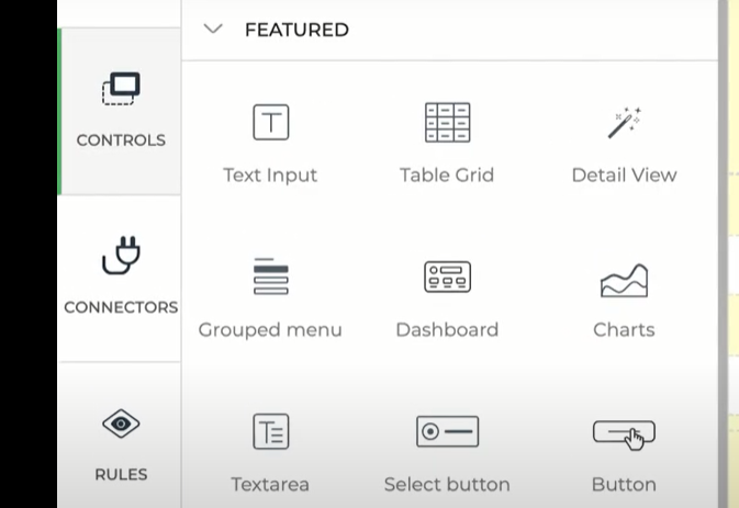
DronaHQ offers 150+ pre-built UI elements like graphs, tables, layouts, listviews, containers, action buttons, form controls, charts and more. Developers can use these interactive elements to design responsive dashboards across devices.
Text area control
The text area control allows the user to multiple lines of text in a single field. It has the ability to hold an unlimited number of characters. For example, it can be used to write product descriptions or accept reviews from customers. The UI properties include labels, type, unique name, tooltip, description etc.
Date and time picker
Date and Time Picker accepts dates and times into a microapp that can be selected from a calendar and a clock widget. Users can set their device’s date and time as default or enter the date and time manually as displayed. Users can view the date and time in Unix epoch time format which can be used for various purposes like accepting appointments.
Responsive output
DronaHQ offers feature-rich and responsive UI elements that empower tech experts and citizen developers to develop applications that are both mobile and web responsive. It allows users to publish dashboards across Android, iOS, as well as web. Developers can build mobile apps, web apps, public links or embed apps on websites.
Create your own UI Controls
With the use of DronaHQs powerful Control Editor, UI designers can design new controls. To use these UI controls, designers can use both drag and drop tools and JavaScript. Some of the best ways to use this feature are by writing CSS code, creating new elements, adding new styles etc.
Role-based views of the dashboard
Use the pre-built components to create role-based views for end users by controlling the access to sensitive data and information. Users can securely share access to data and insights and control the use of data by end users. You can share only the necessary data for the end user to work with while hiding all the sensitive data.
How can we build charts for MongoDB?
Creating MongoDB Charts in DronaHQ
After connecting your MongoDB Database to DronaHQ, you can write queries and transform your data using JavaScript to use as the data source for charts.
>Here is how you connect to MongoDB
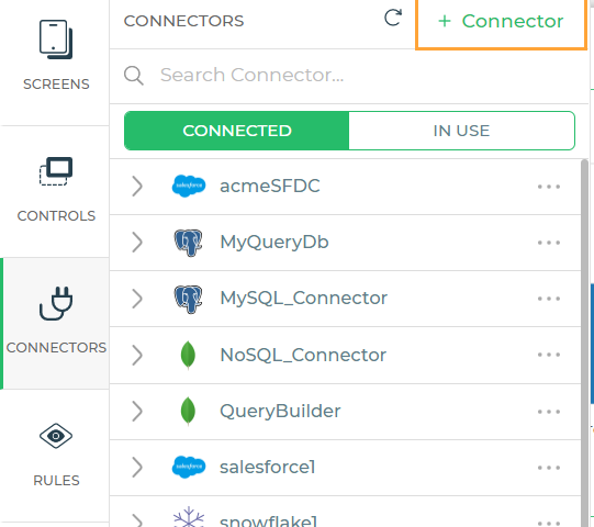
Step 1: Enter basic details for the database connector
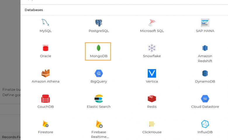
Head over to the panel menu and click on +connectors on the top left. Select ‘MongoDB’ under the connectors menu. Users have to enter a name for the connector they would like to use. This name will be used to refer to the connector in the process of app building. After a name, add a description or the purpose of the connector and click on continue.
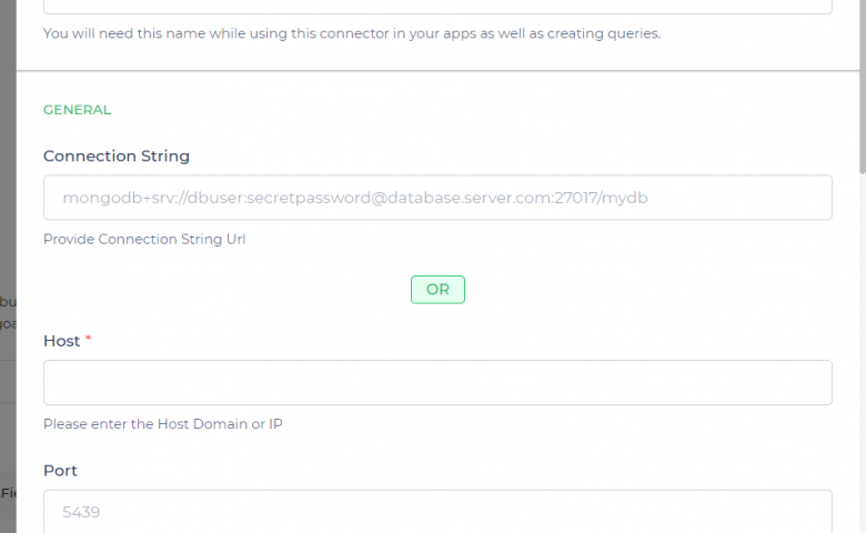
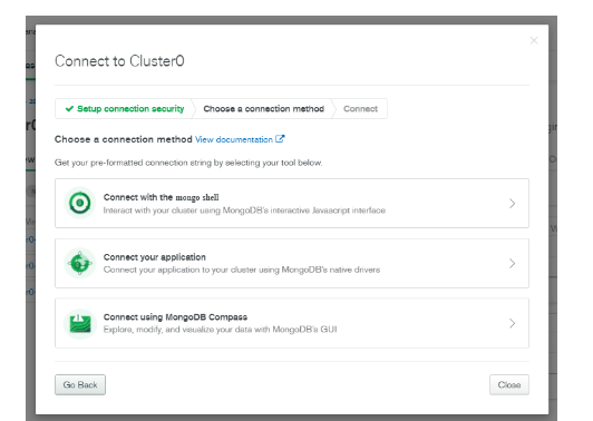
Step 2: Adding the connection string from MongoDB
Click on ‘continue’ under the connection strings menu. You will be directed to “test your connection”. When you click on ‘test’, you will be asked to select the ‘environment’ in which the connector should be available. Users can choose between Dev, Beta and Prod. After selecting the desired environment, head back to your MongoDB database to get your connection string. Move over to ‘clusters’ and click on ‘connect’.
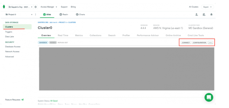
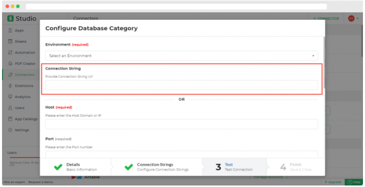
Step 3: Configure the database and test
To get the configuration link, click on ‘connect your application’. Move back to DronaHQ and enter the copied link into the box. Click on ‘submit’ when the field auto-populates. After all the configurations are done, ‘test the request and connection’. Upon successful authentication, you will get a response. Click on ‘continue to finish and save your configuration. The connector should be now added to the list.
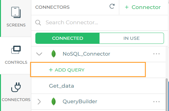
Step 4: Add a query to the database
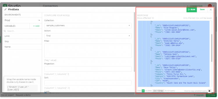
Users have to configure various actions. For example, for the ‘find’ action, the parameters would be filter, sort, limit and skip. Users can use this action to read the data After choosing, click on ‘run’ in the top right corner where you will be able to see the first 10 rows.After assigning the necessary values, you can run the query and the response will be seen as per the parameters given.
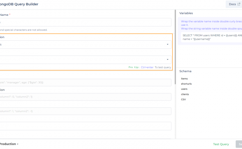
Next, you have to enter a service name, the collection and the action. Users will be able to choose the databases in your cluster under the ‘collection’ dropdown menu. After you are done, click on ‘run’ and you will be able to see the first 10 rows.
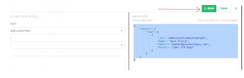
Please note that only the final row will be saved here.
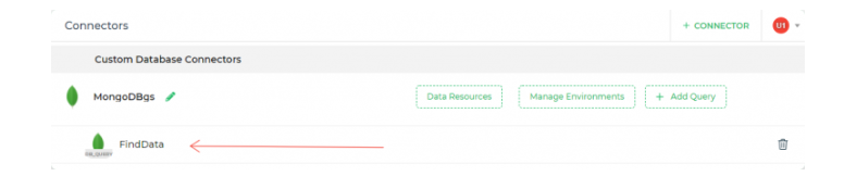
Click on save and you will be able to view the queries under ‘custom database connectors.
>How to add Charts and bind MongoDB data to those charts
DronaHQ’s chart control is built upon Plotly allowing an infinite level of customization. We are going to learn how we can build pie charts.
Step 1: Chart Controls
Head over to the control section and search for charts.
Step 2: Drop it to chart controls
Drop in the 4 columns where you want your chart to be seen.
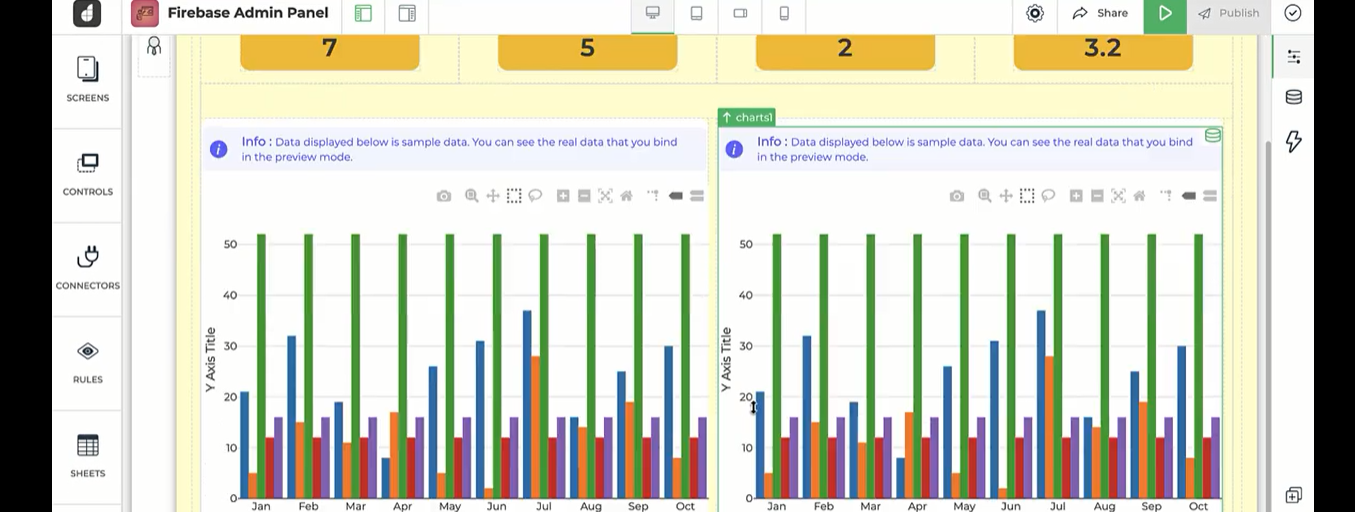
Step 3: Fill in the sections
Every chart has 3 sections – data, layout, and configuration. In the configuration section, you can customize the margin, size, spacing, mode etc.
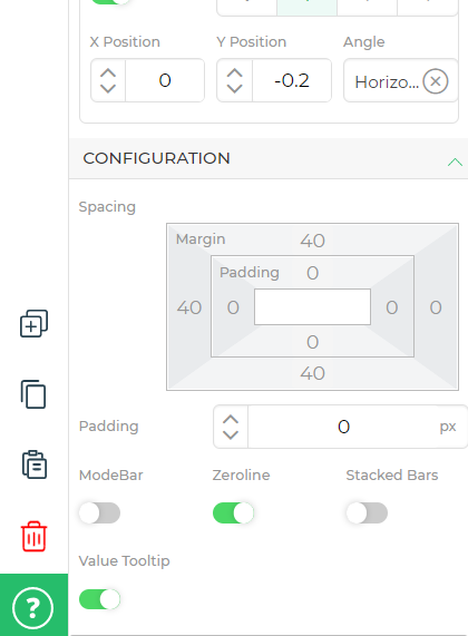
The layout is how you want to visualise or display your data. For example, you can turn on/off the x-axis and y-axis visibility, choose how and where you want to display your legends etc.
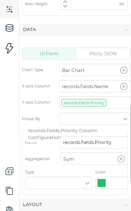
In the data section, you will configure your data. For example what data you want to display on the graph and on which axis etc.
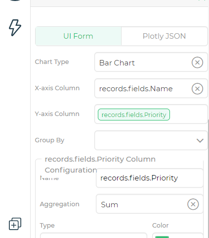
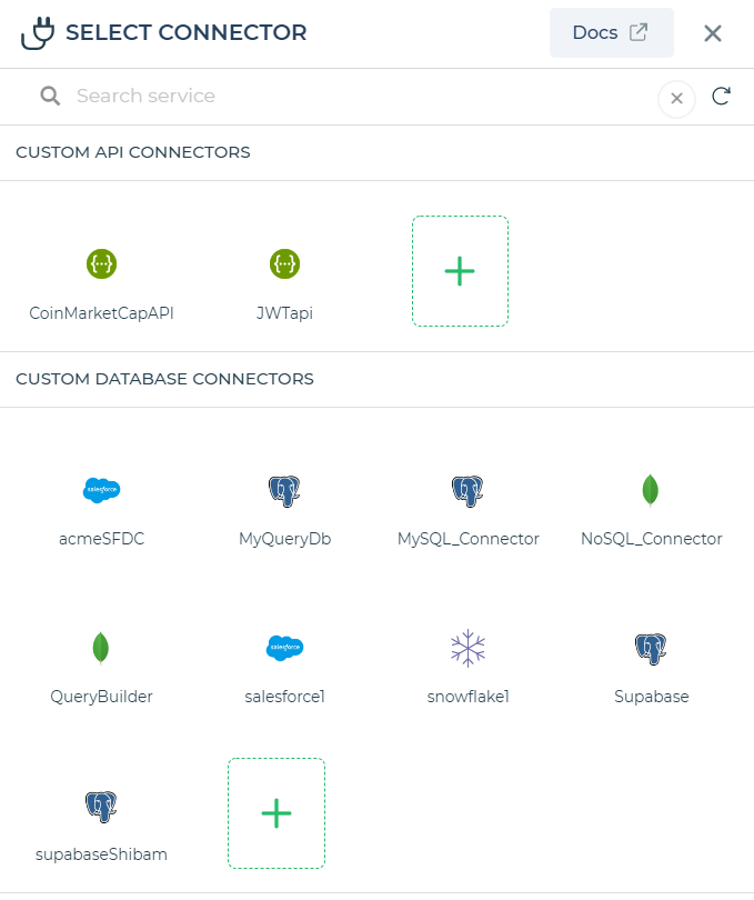
Head over to the ‘bind data’ section. Go to ‘options’ and select ‘connectors’ and choose ‘MongoDB’ and configure the connector. Give an appropriate name and test and finish it.
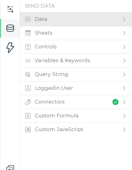
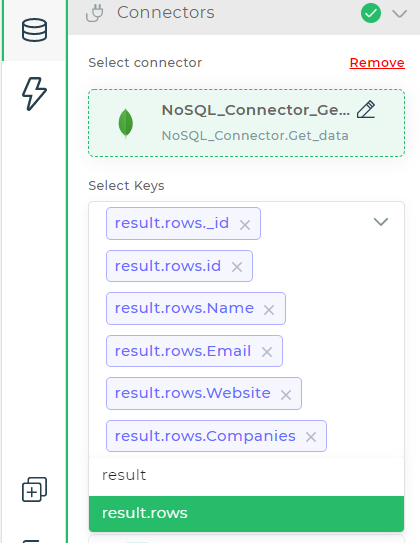
Now select the keys that you want to display in your data. Click on save
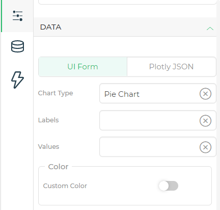
Head back to the ‘data column’. Select ‘pie chart’ in the chart type category. Add labels and values.
Step 4: Preview and publish
Once you have finished adding the values and colours to the pie chart, you can run a preview and you are good to go.
More complicated charts can be configured and customised as well using the same sequence.
Conclusion
DronaHQ offers an intuitive drag-and-drop UI editor to design front ends, advanced pre-built UI components including pre-built UI components, Plotly charts, Kanban, tables, detail view etc. Create highly responsive and intuitive MongoDB charts that can be used across devices including android, iOS and the web. Sign up now for a free trial!