

How to Create a Dashboard that helps in Data-driven Decision Making?
Dashboards are vital business tools for decision-making. Dashboards consolidate different types of datasets and ensure long-range visual tools to present different business metrics more easily and creatively.
Whether it is Bug tracking, marketing performances, sales campaigns, asset health, or project timelines – dashboards help visualise raw data and help you answer critical questions for your business.
There’s a growing expectation that data should inform every move a company makes. Data volumes are up, the cost to store and query said data is down and this is allowing teams to become truly data-driven.
Dashboards allow making sense of large data sets in the form of visualisations. Charts-graphs-tabular form of data representation makes the data easier to scan through and identify insights or patterns for the business.
To ensure that businesses are not lost in this data pool and can make data-driven decisions, the use of dashboards has become mandatory.
Dashboards can provide quicker access to data and add a much-awaited simplification to the data analytics process. In this article, we’ll present a step-by-step guide to create a dashboard.
Here are a few steps that you can take to build a sales dashboard with DronaHQ
Let’s get started.
What are the different types of dashboards?
There are four types of dashboards, namely operational dashboards, strategic dashboards, analytical dashboards, and tactical dashboards. Here are more details about each of these dashboards:
Operational dashboards
Operational dashboards monitor real-time data against a set of pre-defined KPIs. These dashboards get updated pretty frequently. You can track the following types of metrics with a marketing operational dashboard:
- Different website performance metrics like Click Through Rate (CTR), bounce rate, new users
- Social media metrics like number of followers
- Effectiveness of digital paid campaigns with metrics like Return on Ad Spend
Strategic dashboards
Executives use strategic dashboards to keep track of business performance over a certain period. Unlike operational dashboards, the data in strategic dashboards get updated less frequently. These types of dashboards summarize the performance of an organization over a while.
The KPIs that you can track with strategic dashboards are as follows:
- Fiscal performance of the month, quarter, or year
- The account growth rate over a period
- Earnings before interest, depreciation, tax
Analytical dashboards
Analytical dashboards investigate business trends, predict possible outcomes and unlock necessary insights to make efficient business decisions. Analytical dashboards were primarily developed to assist data analysts with their decision-making process. With time and the evolution of low code/no code platforms, marketers, executives, and founders also access this tool.
The types of KPIs that you can track with analytical dashboards are as follows:
- Spending habits of a particular department or entire organization
- Identifying the growth in daily active users over a period
Tactical Dashboards
Enterprises use tactical dashboards to monitor various mid-level management activities and operations. Tactical dashboards are effective for evaluating the performance of an organization against the pre-defined business goals.
The types of KPIs to track on tactical dashboards are as follows:
- Sales performance tracking KPIs like sales conversion rate, customer lifetime value, etc.
- Marketing performance tracking KPIs like Click-Through Rate (CTR), Cost per lead, etc.
Building data-driven dashboards in DronaHQ – A Step by Step Guide
Suppose, you are building a sales dashboard for your organization. A sales dashboard provides an in-depth overview of sales performance, tracks key metrics with graphs and charts, and ensures that the sales team fulfils their sales goals.
Step 1: Login / Signup to DronaHQ
The very first step to building a sales dashboard is logging in to the DronaHQ portal. Click here to sign-up if you don’t have an account already.
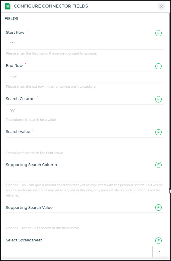
Step 2: Connect to the required sales data sources
After signing up, the first step is to collect different sales data sources of your organization. These sources could be contacts, emails, or other channels. This step will ensure that all data that you require are quickly pulled out in the front-end.
We have prepared a tutorial for the visual learners to understand this process in detail
You can integrate and pull data from a range of sales tools like: Salesforce, Pipedrive, SendGrid, ActiveCampaign, Linkedin, Gmail, Freshdesk, Zendesk, Twilio, Clearbit – and so many more.

Step 3: Filter your sales datasets
Once you have used the visual tools to develop the fundamental structure of your sales dashboard, it is time to filter the datasets. Using DronaHQ’s visual action flow builder to develop action flows within the sales dashboard. So you can configure events on button click, on hover, on value change, and so on.
Step 4: Transform the datasets as per need
The next step is about transforming the datasets by writing JavaScript codes at the database response. DronaHQ also allows you to write custom codes to get the desired data transformation outputs.
Step 5: Add charts to visualise the sales performance
After data transformation is complete, you can add different types of charts to your sales dashboard to have quick access to different sales parameters and metrics like revenue per quarter, top sales deals, top customers, most profitable sales channels, etc.
Step 6: Deploy the features and launch the dashboard
The final step is about deploying all other business-specific features that you may add to the dashboard to align it with your requirements. DronaHQ offers you 100% flexibility in modifying the pre-built sales dashboards. After that, you can publish and start sharing the dashboard with your teammates.
Why should you build a dashboard with DronaHQ?
DronaHQ is a visual drop dashboard builder that assists developers in creating responsive, need-specific applications. You can easily access different databases and APIs, and create applications with pre-built visual components like tables, charts, columns, forms, etc.
Here are the reasons why DronaHQ should be your go-to low code platform for app building:
- Web and mobile output – The apps built once on DronaHQ can seamlessly run on Android, iOS, or web platforms.
- Highly extensible – You can transform API response with javascript or using excel like formulas. DronaHQ’s chart components are powered by an open-source Plotly library. Plotly charts allow creating interactive data visualization. It helps developers to build complex visualizations with Plotly’s JSON schema format.
- Rich user interface designing – experience feature-rich UI designing and front-end logic builder (action flows). DronaHQ comes with a pre-built library of over 100 ready UI controls, including Plotly charts to create custom visualizations.
- Flexible and responsive low-code platform – DronaHQ is a flexible low code platform that provides developers with sufficient room for customization. Developers can use hand-written codes to make an application more responsive and need-specific.
Create useful dashboards with pre-built templates
Low code solutions like DronaHQ can quickly build custom-made internal tools and dashboards with greater convenience. Low code platforms are faster and eliminate all backlogs within the development process.
Planning to create a dashboard for sales operations, internally? These templates will make your job faster:
Where and how can you use interactive dashboards?
Interactive dashboards are useful in most businesses. Dashboards play a key role in updating organizations about the status of their targeted KPIs and assisting them in the data-driven decision-making process.
Here are the different ways in which you can use interactive dashboards:
- An interactive marketing dashboard can help you track all critical and relevant marketing metrics. By regularly monitoring a marketing dashboard, you can achieve your marketing objectives. It further allows you to consolidate all marketing-related information in a single place for easy accessibility and analysis.
- Sales dashboards – A sales dashboard is useful for C-suites and managers to track and control various sales KPIs like sales performance, sales pipeline, sales funnel, etc. to fulfil their sales goals.
- Executive dashboards highlight all those essential KPIs that businesses generally need to run an enterprise. It represents all data that a business may need from time to time to monitor overall performance.
- Flowcharts – Flowcharts help you develop a detailed overview of your existing workflow in a diagrammatic manner. It provides a step-by-step approach to understanding various organizational parameters.
- SaaS Platform Usage dashboards – A SaaS dashboard visualises different SaaS-based metrics like MRR, CLTV, etc., to identify the improvement areas and achieve better performance.
- Learning and Development dashboards – this type of interactive dashboard lets you track different learning metrics to monitor how efficiently you are meeting the training goals for your workforce.
5 Best Practices for Creating Dashboards
Define the objective of your dashboard
Before approaching the dashboard, it is essential to find out who you are targeting with the dashboard. For example, the content of a sales dashboard will be different from that of a marketing dashboard. So, set the objectives first.
You can ask these questions to yourself for setting the objectives correctly:
- Who will be using the dashboard?
- What are the daily activities of the target users of this dashboard?
- What goals are your target audiences trying to achieve through these dashboards?
- What KPIs do they measure to identify whether they have met their objectives or not?
Use authentic data sources
Dashboards play a key role in making efficient business decisions. So, you must identify all the authentic data sources and use clean and correct data in your dashboards. Also, there are no such limitations that you have to stick to the data sources associated with your department only. You can collect datasets from other departments too. However, check the authenticity of these datasets before adding them to your dashboard.
Use appropriate chart types
Dashboards are the best places to visualize the performance and make actionable strategies. So, you must select the correct chart types to ensure optimal visualization of the collected data.
Here are the different types of charts that you can use:
- Bar charts are essential to perform a cohort analysis of your existing operations and keep track of all the latest comparisons and trends
- If you are trying to represent a series of data points in your dashboard, you can use line charts. These types of charts help track development over a particular period.
- To visually represent multiple data series, area charts are also suitable.
Use pre-defined templates
It is difficult to start designing each dashboard from scratch. Use a set of predefined templates that can help you develop the fundamental framework of the dashboard. Afterward, you can make necessary iterations depending on business requirements.
Low code platforms like DronaHQ come with ready-to-use dashboard templates, including layouts, tables, columns, charts, etc. Developers can save a lot of their time as they don’t have to develop everything from scratch. Based on business requirements, they can add custom codes wherever required.
Build a mobile-optimized dashboard
As of 2021, mobile phones account for 54.4% of worldwide traffic. This establishes the significance of building mobile-optimized dashboards for businesses. Mobile dashboards are different from desktop dashboards. Hence, there should be some adjustments to build a mobile-ready dashboard. Most low code platforms automatically allow you to scale a desktop dashboard into a mobile-optimized one.
DronaHQ apps are automatically mobile responsive and can be used like Android or iOS apps as well. UI controls like Containers and functionalities like layouts allow app makers to further enhance dashboard responsiveness.
By bringing the charts, graphs, and more visual UI elements as close to the action as possible, every team is better equipped to be data-driven and work fast. We’re excited to hear what data visualizations you build on DronaHQ.
To learn more check our documentation, explore templates and ready connectors, and start building your dashboards for free.