
Top MongoDB Visualization Tools : 2023
MongoDB is a document database that is highly scalable and flexible to help you with querying and indexing the way you need. It is classified as a NoSQL program that uses JSON-like documents with optional schemas. It is designed to store large-scale data allowing users to work with data efficiently. Developed and managed by MongoDB.Inc under SSPL(Side Server Public License), MongoDB was released in February 2009. We are going to discuss some of the top MongoDB reporting tools. Keep on reading to know more.
Top MongoDB Analytics and Reporting Tool
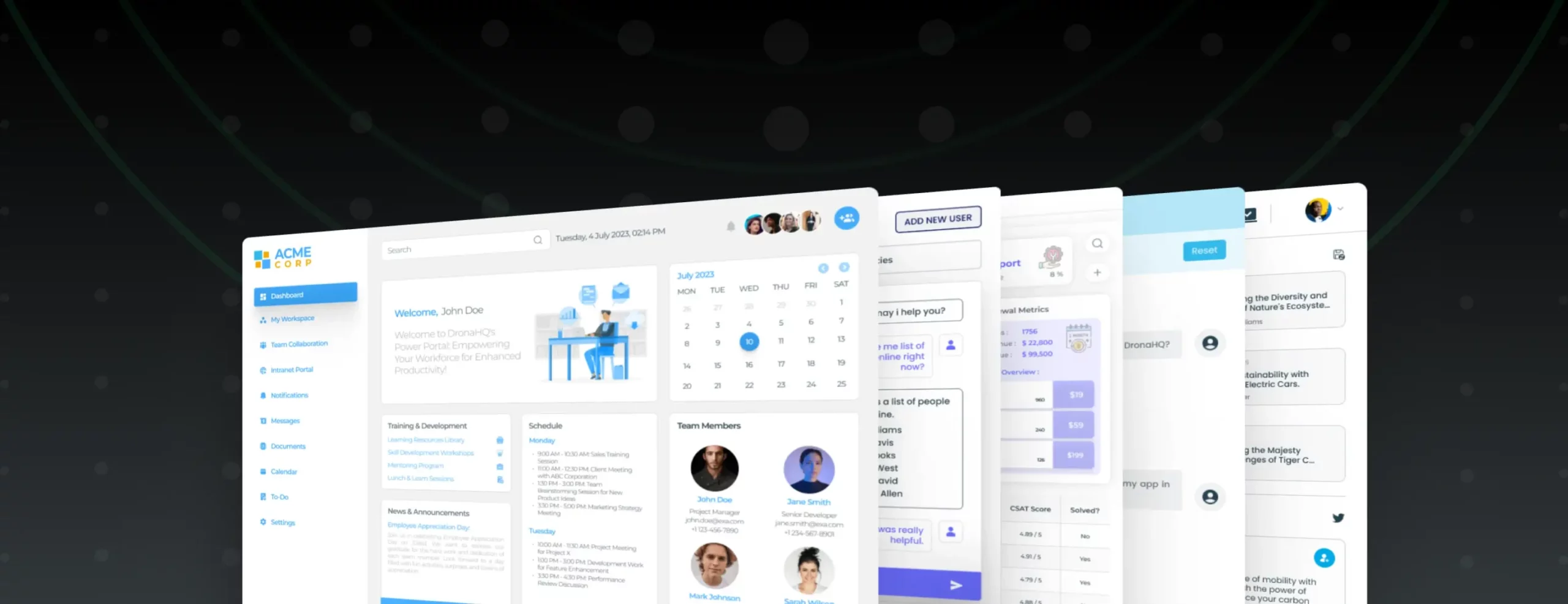
DronaHQ
DronaHQ is a low-code internal tool builder that empowers users to create internal tools like Database GUIs, Admin Panels, Dashboards, and custom apps. Users can create full feature MongoDB visualization and reporting tools, perform CRUD operations and connect to anything with a REST or GraphQL APLI with the help of the WYSIWYG UI editor and pre-built controls. DronaHQ’s visual builder is easy to learn and offers reusable controls like charts, grids, tables, lists, detailed views, buttons, form fields, and custom UI to empower users to build powerful tools at an accelerated speed.
Top Features–
- Pixel perfect design to experience seamless drag-drop and build the interface.
- Pre-built controls include a huge library of form and visual controls.UI builder controls include a feature-rich table component, partly powered charts, card lists, date-picker, lists, checkboxes, tabs, and many more.
- Easy customization of UI properties to reflect the branding elements.
- Unlimited users are supported in all pricing plans.
- Access your database GUI from any end-user portal.
Price: See all pricing details here.
Knowi (NoSQL)
Knowi is a business intelligence tool that offers search-driven analytics, dashboards, and a single view of all your data across all sources. It empowers businesses to use data, structured or unstructured, with no need to transform or migrate. It features a full-stack analytics platform with built-in integration of all the popular NoSQL data sources, cloud APIs, and relational data sources. Knowi’s self-service BI boasts natural language capabilities that allow users to communicate in English. Its native integrations are suitable for iterative work to accelerate dataset creation enabling data scientists, data engineers, and business teams to work productively.
Top Features –
- Secure connection to all data sources.
- Supports native integrations to SQL and NoSQL-based data sources.
- Dashboards and reports, ad hoc analysis, and self-service data visualization.
- Enterprise-level security for all databases.
- Capable of discovering, querying, cleaning, aggregating, and pipelining data across heterogeneous data sources.
Price: Quotation based. See here.
DBSchema
DB Schema is a MongoDb visual designer for MongoDB allowing users to design the MongoDB validation rules, for defining a clear way to organize data. Users can share the validation rules in a team and deploy them on different databases. It offers output HTML5 documentation, documentation, and validation schema allowing users to build native MongoDB queries, explore data visually, build reports, generate random data, and more. Users can also compare the validation schema between two databases.
Top Features –
- Design, document, and share the design model across teams.
- Supports all relational and NoSQL databases including MongoDB, MYSQL, SQLite, PostgreSQL, MariaDB, and more.
- Visual design and HTML documentation to interact with the database visually supporting operations like generating test data, writing queries, importing data etc.
- Offers an independent model where users can share the model file in a team using GIT.
- Offers flexible analytics designer with tables, charts, input fields, buttons, and more.
Price: See pricing details here.
Fine Report
Fine Report is an enterprise web reporting and BI software that allows fast access to users’ data anywhere. Trusted by over 8,000 companies, its seamless drag-and-drop interface attracts many users. It enables users to streamline the detection of opportunities, trends, and operations where managers can visually review business performance. Even non-technical users can keep up to date with data entry using functions like temporary storage and data validation. Fine Report’s API streamlines the customization process of reporting simplifying the work of the core IT team.
Top Features –
- A simple and straightforward drag and drop operation mode.
- Offers cross-sheets and multi-sheet calculations.
- Allows users to design complex reports in any pattern in a WYSIWYG.
- Features complex report, data report, interaction analysis system.
- Perfectly compatible with excel sheets and offers secondary development, mobile applications.
Price: Quotation based here. See here.
Panoply
Panoply enables users to gather data from every corner of their companies into a single source of truth (SSOT). It is a cloud data platform with a native ETL for MongoDB. Both experts and non-technical users can set up a pipeline into Panoply in just a few minutes. Data is transferred in form of tables that fit into a relational model enabling SQL querying and connections to several popular analytics and BI tools.
Top Features –
- Has the ability to draw data from over 100 sources including eCommerce sites, CRM products, APIs, databases, and an organization’s intranet.
- Features a user-friendly interface and allows users to analyze data code-free and speedy setup.
- Enables users to improve data literacy across the whole operation by reducing silos.
- Automated data ingestion and schema reindexing allow users to keep their data up-to-date.
- Accelerated query speeds by reducing data engineering maintenance tasks like vacuuming through AI.
Price: See all pricing details here.
Izenda
Izenda hosts a code-free connection to web services available to users to create complex queries in plain English using self-service BI technologies, making it a search engine for your business data. It also offers databases for reporting, dashboards, and visualizations. Users can customize, share dashboards and work in real-time speeding up vital business processes. Izenda is a web-based platform that works on any device inheriting your platform’s privacy and security model to comply with general standards. It is also capable of integrating into previous platforms and workflows.
Top Features –
- Features Report Designer 2.0 to enable/disable new report designer.
- Offers a scalable node-based solution allowing users to export functionalities.
- NQL supports multi-tenancy and services can be configured on a per-tenant basis.
- Features asynchronous export functionality that controls how often helper processes will evaluate the queue of the export jobs.
- Supports REST API sources that can be added to data connector pages.
Price: $999- $1999 based on features and data size.
Cluster Control
Cluster Control is a database management tool that offers a simple web graphical interface for autoscaling, monitoring, and managing cluster databases with Galera Cluster, MySQL Cluster, and MySQL Replication support. It is a useful tool for scaling monitoring and deploying database clusters. Cluster control offers a central interface for operating one or multiple clusters and has the power of managing the whole cluster instead of separate DB bodies. It also automates crucial operations like node health and performance checks and management tasks such as rolling starts and cluster-wide configuration changes.
Top Features –
- Offers an API allowing businesses to integrate their system with third-party solutions like Slack, HipChat, Telegram Zabibix, Pager Duty, etc.
- Offers monitoring functionality allowing data analysts to conduct health checks and monitor database stacks across multiple data infrastructures.
- Offers single sign-on capabilities, and empowers administrators to configure role-based access rights ensuring data security and business compliance.
- Enables team members to create and store custom configuration templates.
Price: starting at $250 per month.
Tableau
Tableau is a data visualization tool that offers interactive reports and dashboards. It includes functionality to create metrics, create a data model and join data from multiple sources. Tableau allows users to enhance the data visualization with time-based charts, and geo maps, assign responsibilities for organization units to specific users, and apply model security.
Top Features –
- Data updates automatically at chosen intervals and offers real-time analytics of important business metrics.
- Intuitive UX design allows users of all technical levels to use analytics and create visualizations.
- Supports visualization of data from multiple sources on a single platform.
- Provides role-based permissions to access and manage data.
- Supports dashboard sharing across teams.
Price: See here for details.
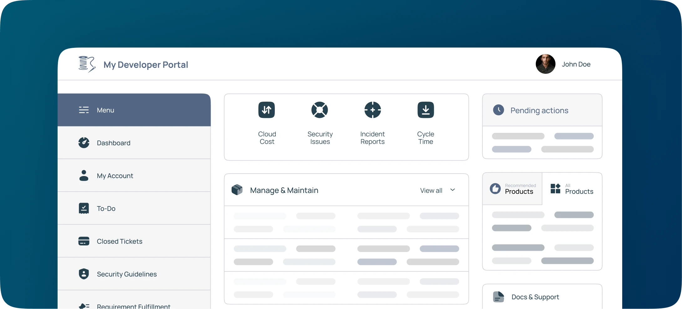
How to visualize your MongoDB data with DronaHQ
DronaHQ allows a direct connection to your MongoDB database. Choose from a library of over 100+UI controls to build interactive MongoDB charts, graphs, tables, lists, and more. Add action buttons to write safely to your database and pull queries into a text or table component. Build applications quickly and easily with DronaHQ integration to your MongoDB database. Quickly access your MongoDB database to execute queries for fetch, update, insert, delete, and more using more connectors. You can build an interactive sales dashboard, admin panel, GDPR report, contact us form, and more to meet the requirements of your business.
> How to build a MongoDB Visualization Tool on DronaHQ
DronaHQ offers an intuitive and straightforward interface allowing users to build CRUD UI in minutes. Here is an example of how you can build a CRUD interface for a database with customer details
Step 1: Connect to the data source
To begin with, you have to sign in to your DronaHQ accounts. After signing in, click on “+connectors” and select MongoDB. Define the name for the connector, connection string, or alternatively the host, database name, username, and password. After that, you can test your connection by clicking on “Test connection” and clicking on “Save” to proceed with the UI design. Now you can assign the necessary value and run the query. You will have to define the service name, collection, and action. Suppose you have named it “find one”. Select the “find” action for the customer portal use case. You will be able to see the databases in your cluster under the collection dropdown menu. After assessing the response, click on save and move on to the next stage.
Step 2: Creating a data-driven user interface
To start building your app from scratch, click on “apps” and then on the “+ sign”. Users can also choose from the templates and bind them to the MongoDB connector. A new tab will be opened. Select your desired input and it will be added to your app. Let’s say you used the table grid function to put data to these UI components. Select the table grid from the menu, click on the database icon and move over to the add the custom function. Insert the formula and repeat the steps for detail view control. You can add more CRUD operations by configuring actions in the table grid to create a new record, edit a record or delete a record.
Step 3: Share your application
You can easily share the app by clicking on the “share” button on the top right corner of the page. You can also invite users to the application and determine user permissions like editor, app end user, and so on. Your end users can access the app without having an account on DronaHQ.
Step 4: Deploy your application
On the right of the “share” button, you will find the “publish” button. Click on it and start using the app on a web browser, android, or IOS device right away.
Why DronaHQ for data visualization and reporting?
DronaHQ offers 150+ pre-built-in power controls like tables, grids, charts, dashboards, etc to develop visually engaging and innovative tools. It also enables users to create custom UI components (with and without coding) and offers connections to different data sources like APIs and databases to power front-end UI elements and bring disparate data and tools together. DronaHQs visual logic builder allows users to configure actions like value change, button click, hover, and more while visibility rules and validation can be configured using a simple point-and-click interface. It offers user-based pricing that allows enterprises to build solutions that are both web and mobile-responsive.
Sign up for a free trial.
Related Articles