
Top React calendar components
Choosing the right React calendar component can save you days of work and keep your app both performant and accessible. In this guide, you’ll find a curated list of the top React calendar libraries, complete with feature breakdowns, pros and cons, and use-case recommendations. Whether you need a lightweight date picker or a full event scheduler, you’ll know exactly which package to pick and why.
What to look for in a React calendar component
Before we jump into specific libraries, here are the key criteria to evaluate:
- Bundle size and performance
- Customisation and theming
- Accessibility and keyboard support
- Feature set (range selection, event slots, drag and drop)
- Mobile and responsive design
- Community activity and maintenance
Keep these in mind as you compare options below.
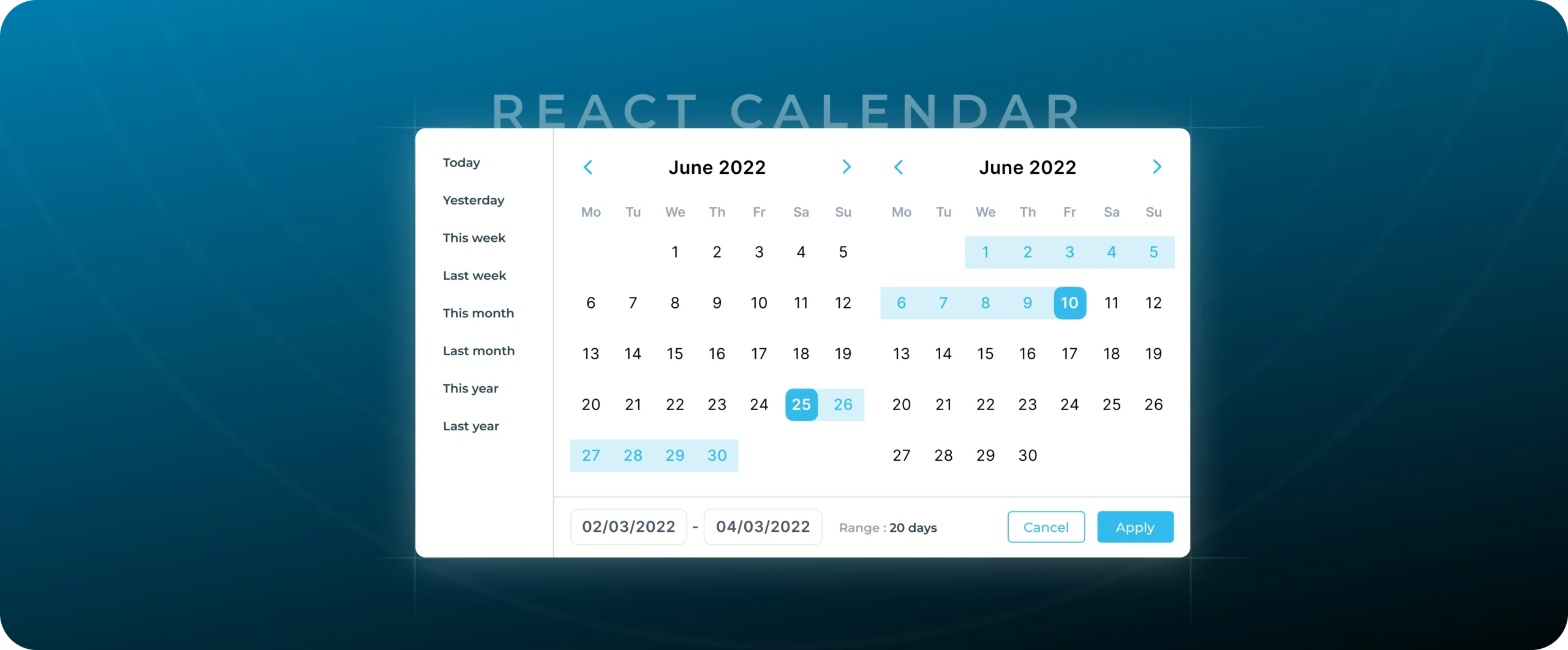
React calendar
React Calendar is the go-to library if you want a no-frills, accessible widget for selecting dates or date ranges in React JS calendar projects.
import React, { useState } from "react";
import Calendar from "react-calendar";
import "react-calendar/dist/Calendar.css";
export default function CalendarExample() {
const [value, setValue] = useState(new Date());
return (
<div style={{ maxWidth: 320, margin: "0 auto" }}>
<Calendar value={value} onChange={setValue} />
<p>Selected date: {value.toDateString()}</p>
</div>
);
}
Features
- Supports month, year, decade, and century views
- Built-in range selection
- Fully ARIA compliant
- Straightforward theming via CSS variables
Pros
- Minimal bundle size (≈14 kb gzipped)
- Excellent documentation
- Frequent releases and active maintainers
Cons
- Limited event-scheduling features
- No built-in time picker
Best for
Simple date pickers or range selectors in forms and dashboards.
React big calendar
React Big Calendar wraps the popular Google-style calendar view into a React-based calendar app. It’s ideal when you need month, week, day, and agenda layouts with event management.
import React from "react";
import { Calendar, dateFnsLocalizer } from "react-big-calendar";
import { parse, startOfWeek, getDay, format } from "date-fns";
import "react-big-calendar/lib/css/react-big-calendar.css";
const locales = { "en-US": require("date-fns/locale/en-US") };
const localizer = dateFnsLocalizer({ format, parse, startOfWeek, getDay, locales });
const events = [
{ title: "Team Meeting", start: new Date(), end: new Date() }
];
export default function BigCalendarExample() {
return (
<Calendar
localizer={localizer}
events={events}
startAccessor="start"
endAccessor="end"
style={{ height: "75vh", margin: "0 auto" }}
/>
);
}
Features
- Customizable views (month, week, day, agenda)
- Drag and drop support via React DnD.
- Localisation and custom date formats
- Selectable time slots
Pros
- Rich event handling API
- Pluggable styling with CSS or styled components
- Active community and ecosystem
Cons
- Larger bundle size (≈100 kb gzipped)
- Steeper learning curve for custom views
Best for
Enterprise applications that require complex event scheduling.
Fullcalendar React
Fullcalendar React is the official React wrapper around Fullcalendar’s powerful vanilla JS core. It excels if you need advanced interactions and timeline views.
import React from "react";
import FullCalendar from "@fullcalendar/react";
import dayGridPlugin from "@fullcalendar/daygrid";
import "@fullcalendar/common/main.css";
import "@fullcalendar/daygrid/main.css";
export default function FullCalendarExample() {
return (
<FullCalendar
plugins={[dayGridPlugin]}
initialView="dayGridMonth"
events={[{ title: "Conference", date: "2025-07-07" }]}
height="auto"
/>
);
}
Features
- Timeline and resource management
- Recurring events
- Intelligent date and time parsing
- Plugins for Google Calendar and spreadsheet feeds
Pros
- Battle-tested in production by thousands of companies
- Highly extensible plugin architecture
- Detailed event display controls
Cons
- Biggest bundle size among calendar React libraries (≈250 kb gzipped)
- Commercial license for premium plugins
Best for
Applications that need advanced booking systems or resource planning.
React day picker
React day picker focuses on accessibility and customizability in a lightweight package for React JS calendar needs.
import React, { useState } from "react";
import { useDayPicker, SelectSingleEventHandler } from "react-day-picker";
import "react-day-picker/dist/style.css";
export default function DayPickerExample() {
const [selected, setSelected] = useState();
const { DayPicker, dayPickerProps } = useDayPicker({
mode: "single",
selected,
onSelect: setSelected as SelectSingleEventHandler
});
return (
<>
<DayPicker {...dayPickerProps} />
{selected && <p>You picked {selected.toLocaleDateString()}.</p>}
</>
);
}
Features
- Headless architecture for full control over markup
- Support for range, multiple, and single date selection
- Month and year navigation helpers
- Localisation via date-fns or Moment
Pros
- Smallest footprint when used in headless mode
- Excellent for custom designs
- Strong emphasis on accessibility
Cons
- Requires more boilerplate to style
- Fewer out-of-the-box features compared to Fullcalendar React
Best for
Design-driven projects where you need full control over calendar markup.
React modern calendar datepicker
React Modern Calendar Datepicker delivers a polished, out-of-the-box UI for common date-picking patterns.
import React, { useState } from "react";
import { Calendar } from "react-modern-calendar-datepicker";
import "react-modern-calendar-datepicker/lib/DatePicker.css";
export default function ModernDatepickerExample() {
const [selectedDay, setSelectedDay] = useState(null);
return (
<Calendar
value={selectedDay}
onChange={setSelectedDay}
shouldHighlightWeekends
colorPrimary="#4f46e5"
/>
);
}
Features
- Built-in year and month dropdowns
- Keyboard navigation
- Compact mobile layout
- Theming via styled components
Pros
- Sleek default styles
- Minimal setup
- Responsive by default
Cons
- Limited customisation compared to headless libraries
- Smaller community
Best for
When you want a visually appealing datepicker that works instantly.
React datepicker
React datepicker is a popular, battle-tested library with extensive configuration and built‑in time picker support.
import React, { useState } from "react";
import DatePicker from "react-datepicker";
import "react-datepicker/dist/react-datepicker.css";
export default function DatepickerExample() {
const [startDate, setStartDate] = useState(new Date());
return (
<DatePicker
selected={startDate}
onChange={setStartDate}
showTimeSelect
dateFormat="Pp"
/>
);
}
Features
- Select a time alongside a date
- Financial quarter and week number support
- Multiple-month display
- Highlighted and disabled dates
Pros
- Nearly 1 million weekly downloads
- Comprehensive API and hooks
- Built‑in localisation
Cons
- Additional bundle size (~30 kb gzipped)
- Styling via CSS overrides only
Best for
When you need date and time selection in a single component.
React infinite calendar
React infinite calendar offers a mobile‑focused experience with infinite scrolling through months.
import React from "react";
import InfiniteCalendar from "react-infinite-calendar";
import "react-infinite-calendar/styles.css";
export default function InfiniteCalendarExample() {
return (
<InfiniteCalendar
width={350}
height={400}
selected={new Date()}
displayOptions={{ showHeader: false }}
todayHelperRowClassName="today-helper"
/>
);
}
Features
- Infinite scroll through past and future months
- CommonJS, UMD, and ES6 builds
- Built‑in keyboard navigation
Pros
- Smooth mobile UX
- Customizable theming
- Small runtime overhead
Cons
- Fewer built‑in scheduling features
- Community maintenance is episodic.
Best for
Mobile apps that need seamless month‑scroll calendar navigation.
DronaHQ calendar and date/time controls
Instead of a React‑only wrapper, DronaHQ offers native UI controls you can bind directly in your apps:
- Calendar control – Displays events in month, week, day views; supports create/update/delete, theming, and click events.
- Date picker – Single date selection with keyboard and mobile support
- Date range picker – Select start and end dates in one control.
- Date time picker – Combined date and time selection in a unified interface.
- Time picker – Select hours and minutes with AM/PM or 24h modes.
- Range picker – Select numeric or date ranges with a dual-thumb slider.
- Timeline – Display events along a horizontal time axis for visual schedules.
These controls integrate seamlessly with DronaHQ data sources and actionflows, so you can bind events or user input without additional code.
How to choose the right library
Use this quick guide to match your project needs:
- Simple picking: React calendar or React modern calendar datepicker
- Design‑heavy custom UI: React day picker in headless mode
- Date & time combined: React datepicker or DronaHQ date time picker
- Infinite mobile scroll: React infinite calendar
- Event scheduling: React Big Calendar or DronaHQ Calendar Control
- Resource planning or timeline views: Fullcalendar React or DronaHQ timeline
Next steps
Once you’ve narrowed down your options, try each library or control in a minimal sandbox. Test your theming requirements, check performance in your build, and verify accessibility with keyboard and screen‑reader tools. Start building >
Related Articles