
Internal tools UX design best practices
Not every tool needs to be beautiful. But internal tools? They have to work.
Internal apps are where the real work happens: approving vendors, resolving escalations, processing refunds, and managing logistics. Yet, despite their importance, these tools are often clunky, inconsistent, or frustrating to use.
That’s why great UX for internal tools isn’t just a “nice to have.” It directly impacts team productivity, data accuracy, and user morale. A well-designed internal tool can save hours, reduce errors, and make operations run smoother. A bad one? It becomes shadow IT—avoided or replaced by spreadsheets.
In this blog, I’ll share UX design principles and patterns tailored for internal tools, grounded in real-world usage, 2025 practices, and research across enterprise teams, design leaders, and product builders.
What counts as an internal tool in 2025?
“Internal tools” is a catch-all phrase. But depending on the org, this could mean:
- Admin dashboards
- Approval workflows
- Ops & logistics panels
- Customer support consoles
- CRM enrichers
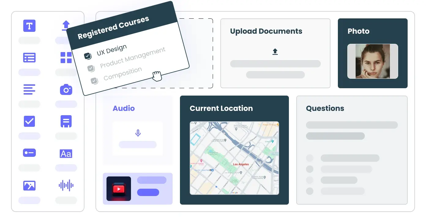
- Internal wikis and forms
These tools are used by employees, not end users. That distinction matters: the goal of UX here isn’t delight—it’s efficiency, reliability, and speed.
Why UX for internal tools matters
Bad UX slows teams down. If someone has to click through five tabs to issue a refund, that’s friction. If form errors aren’t clear, that’s time wasted on Slack or support tickets. Multiply that across hundreds of actions a day and the cost becomes real.
According to Forrester, every $1 invested in enterprise UX yields roughly $100 in return. Why? Because better-designed tools reduce:
- Human error
- Support burden
- Training time
…and increase:
- Task speed
- Employee satisfaction
- Tool adoption
You’re not meant to design for growth and engagement, but instead for efficiency and speed.
1. Design for efficiency, not exploration
Internal tool users don’t want to “discover” features. They want to get in, get things done, and move on.
Best practices:
- Prioritize common actions up front
- Avoid deep nesting of menus
- Reduce clicks to task completion (ideally 2–3)
- Use familiar UI patterns: tables, search bars, and modals
Example: In Stripe’s internal admin, issuing a refund is available directly in the transaction details panel without digging through tabs.
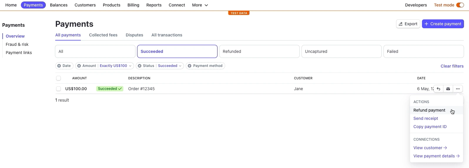
“Consistency is vital: internal tools are usually part of a larger family of products, consisting of visual and spoken languages.” – Data & Design
2. Understand your real users (not just stakeholders)
PMs and managers may request features, but they aren’t the ones processing 300 tickets a day. Sit with frontline users. Watch what slows them down.
Conduct:
- Shadowing sessions
- Task-based usability tests
- Heatmaps or session replays
Example: At Revolut, designers sat with KYC analysts and learned that toggling between tools led to 30% time loss per case. That insight led to unifying actions into a single panel.
3. Map user maturity
Beginner users need guidance. Power users need speed. Design with both in mind:
- Onboarding tooltips and modals
- Bulk edit, shortcuts, and hotkeys for pros
- Undo and escape options for all
Example: Intercom’s internal console has command-line triggers for senior agents, but also offers contextual guides for new hires.
Molly Archive says, “Design for the user’s maturity level—provide scaffolding for novices and autonomy for pros.”
4. Show, don’t interrupt: microinteractions matter
Small feedback loops increase user trust.
- Use optimistic UI where possible (e.g. UI updates before server confirmation)
- Inline validation (don’t wait for form submit)
- Avoid modal overload: use toasts or subtle banners
Example: Linear shows a non-blocking toast after updates and auto-saves changes in the background.
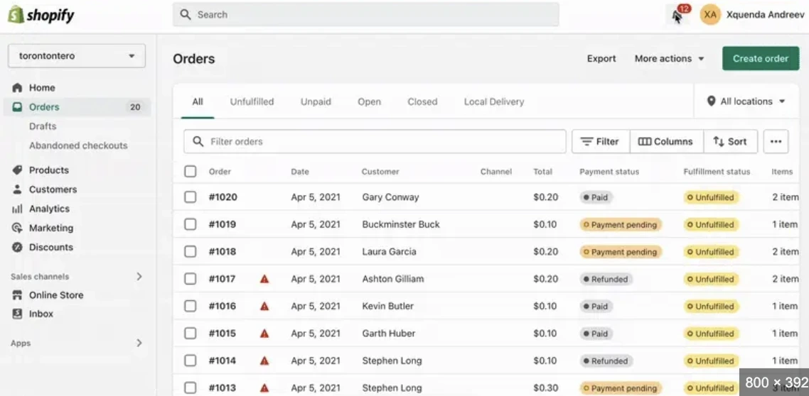
5. Progressive disclosure and smart defaults
Don’t overwhelm users. Instead:
- Show only relevant fields upfront
- Use toggles or “advanced” sections
- Pre-fill fields using known data
Example: In Shopify’s admin, advanced shipping settings are hidden behind expandable sections to reduce clutter.
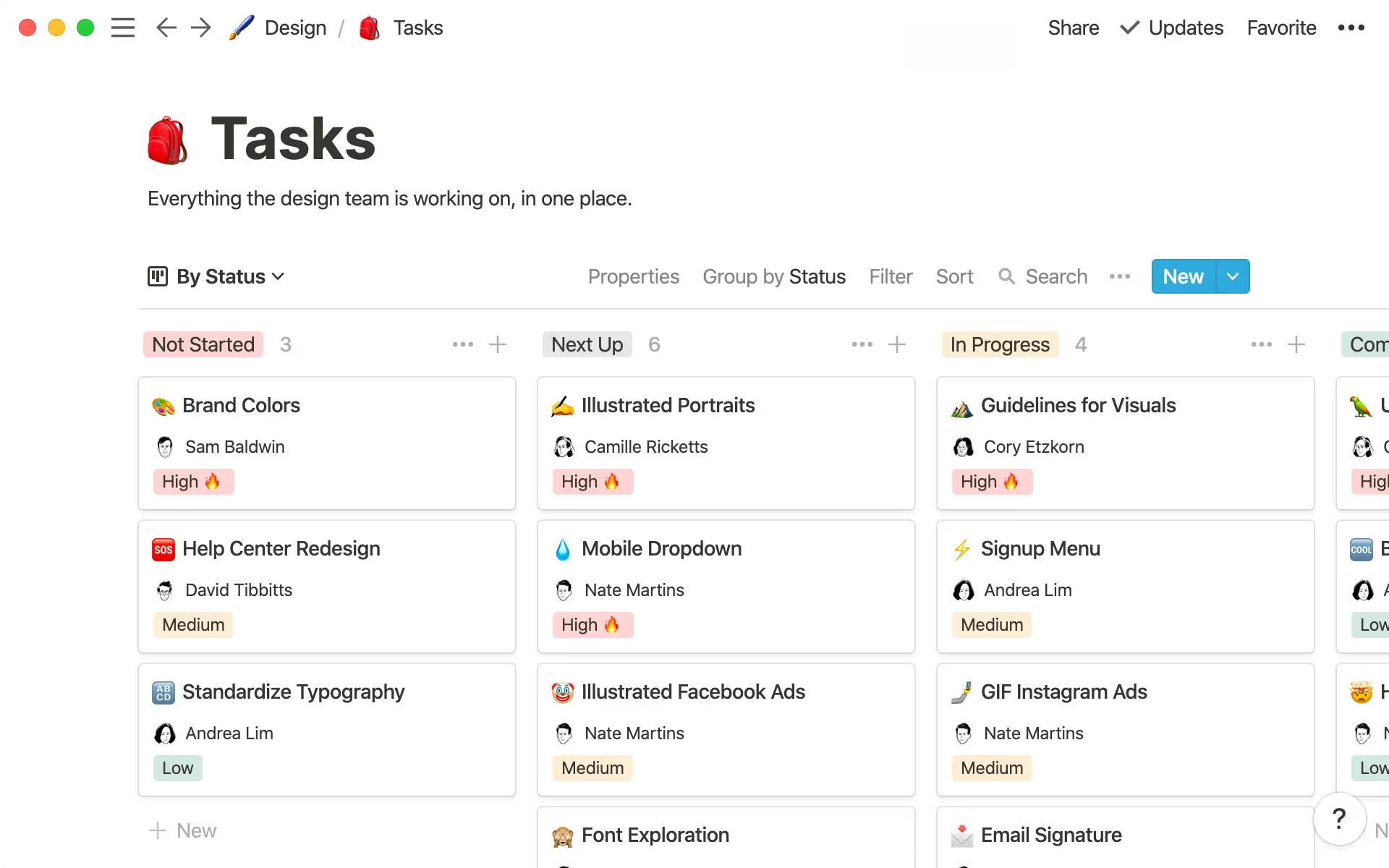
6. Support collaboration and comments
More teams are using internal tools together.
- Add inline comments or threads on records
- Show activity history or change logs
- Enable @mentions or Slack-like handoffs
Example: Notion offers shared views with inline comments and real-time collaboration.
7. Use real-time feedback, not guesswork
Don’t leave users wondering if something worked.
- Show immediate confirmations
- Use WebSocket or polling for real-time updates
- Avoid manual refreshes or page reloads
Example: Notion syncs across tabs and users in real time, even in internal teamspaces.
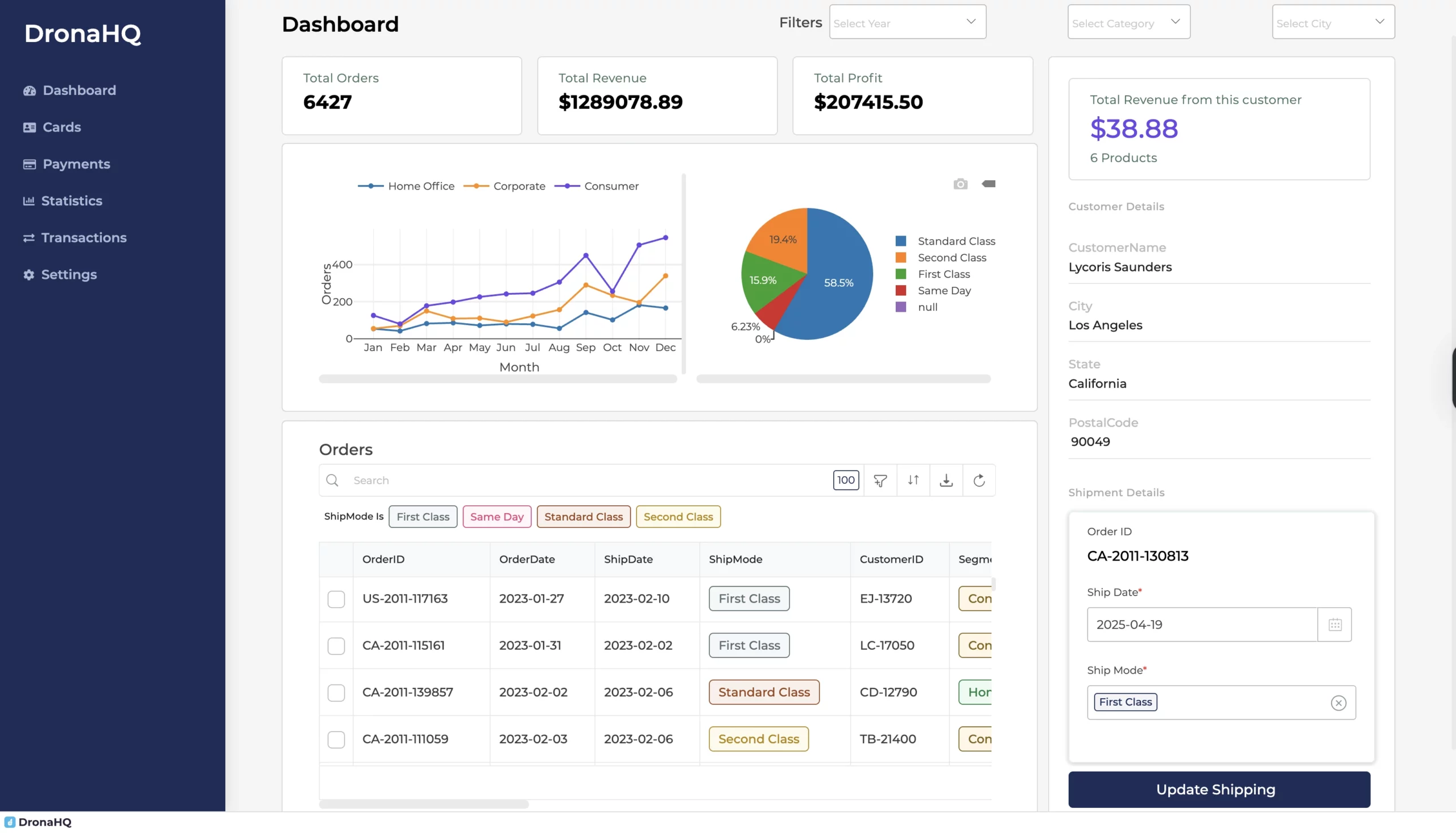
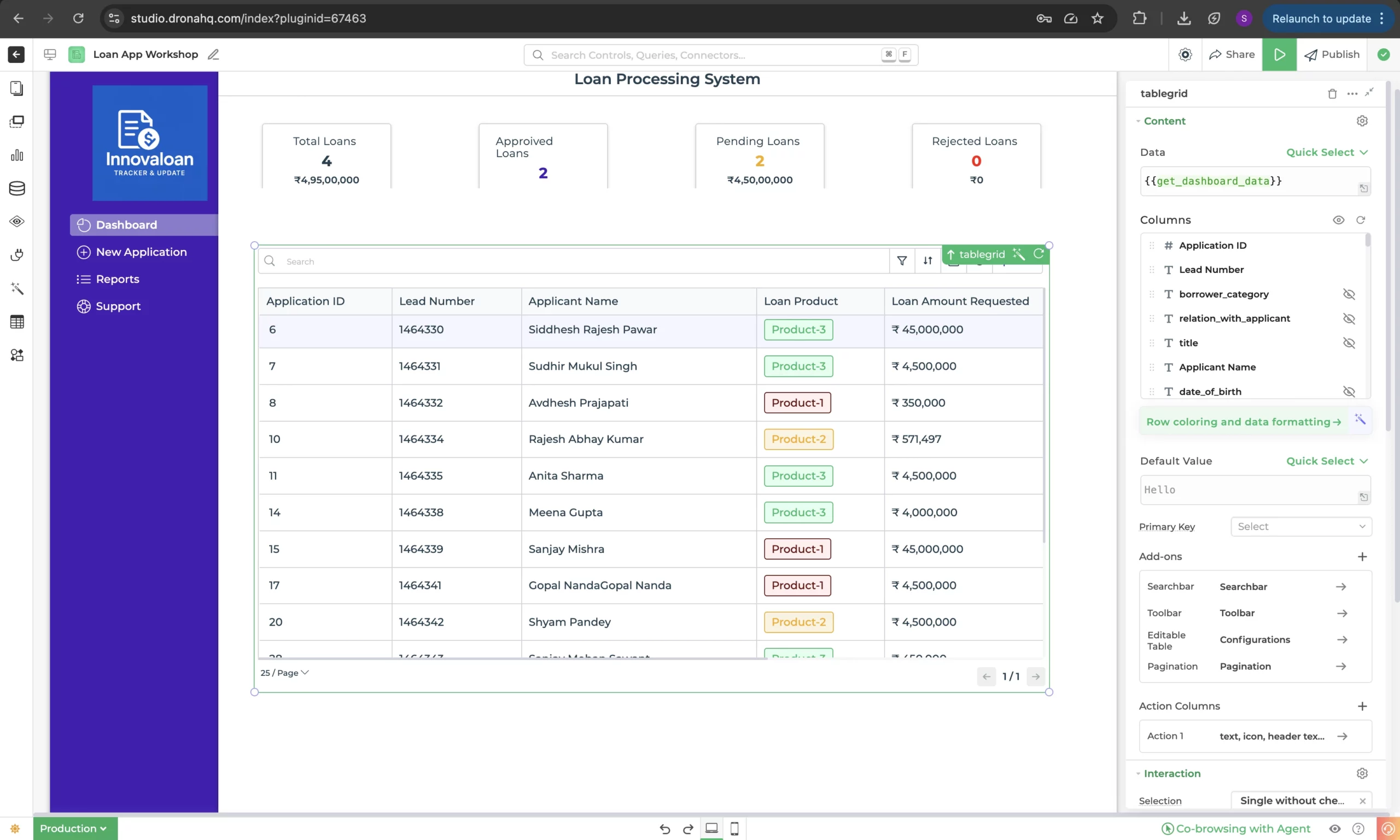
8. Design for scalability
Internal tools often start small and grow fast.
- Virtualized tables for large datasets
- Smart filters and search
- Let users save custom views
Example: DronaHQ apps with thousands of records use pagination, search, and table virtualization to maintain speed.
Read also: Best practices when designing a Table UI >
9. Enable power users
Recognize usage patterns and build around them.
- Add keyboard shortcuts
- Provide CSV exports or API triggers
- Include Spotlight-style command palettes
Example: Superhuman-style nav has entered internal tools too; like cmd+k search in many dashboards.
Maturing users crave autonomy, so surfacing fast lanes and customizations helps them thrive.
10. Accessibility and inclusivity
Don’t assume every internal user is tech-savvy or fully able-bodied.
- Ensure keyboard navigation
- Meet WCAG color contrast standards
- Use proper semantic HTML for screen readers
Example: GOV.UK design system includes accessibility by default. Many teams build internal tooling on top of it for faster and more inclusive development.
11. Think API + UI together
Internal apps rely on live data. So:
- Use robust error handling and empty states
- Show sync status or retries
- Log background job outcomes for transparency
Example: GitHub’s internal tools surface webhook failures in UI, not buried in logs.
12. Add guardrails (but don’t overdo it)
Some actions are critical: refunds, deletions, bans. Use guardrails:
- Confirmations for destructive actions
- RBAC (role-based access)
- Activity logs for traceability
But avoid friction for everyday actions. Not every dropdown needs a warning.
Final thoughts
Internal tools don’t need to be pretty. But they do need to work fast, clearly, and intuitively.
If your team is drowning in tools that feel like a maze of modals and dropdowns, it’s worth investing in better UX. And if you’re short on time or frontend devs, DronaHQ can help.
With a visual builder, pre-built components, and AI-powered scaffolding, DronaHQ lets you build polished internal tools in hours, not weeks. Try it free or explore our component library to see what’s possible.
Related Articles