
Build internal tool UIs faster with DronaHQ’s Figma Design System
Designing polished internal tools is one thing. Getting those designs built quickly and consistently is another.
To help close that gap, we’ve launched the DronaHQ Figma Design System, a flexible UI system that makes it easier for teams to go from interface design to working apps. Whether you’re designing dashboards, forms, or admin panels, the kit gives you reusable, production-aligned components built to match DronaHQ’s frontend.

You can design clean, consistent UIs directly in Figma and bring them into DronaHQ without starting from scratch or reworking every screen.
With this kit, you can maintain brand consistency, speed up your design workflow, and hand off your assets seamlessly to developers, all while focusing on creating beautiful and functional app interfaces.
Designs often look great in Figma but fall apart during handoff. Components get rebuilt, spacing gets rechecked, and consistency takes a hit.
This guide walks you through how to use the DronaHQ Figma Kit to create cleaner handoffs, faster builds, and interfaces that stay true to the original design. From layout tips to advanced control options, it’s everything you need to go from design to deploy with less rework.
What’s inside the Design System?
The DronaHQ Figma Design Kit is a fully customizable design system.
You can adjust it as per your project needs or brand requirements. Let’s see what you get:
Component Library: In the Component Library section of the DronaHQ Figma Design Kit, you’ll find various categories like Featured, Basic, Selection, Native, and more.
This structure closely mirrors the component categories available inside the DronaHQ app builder, making it easy for developers and designers to work in a familiar environment when moving designs into live apps.
Icon pack: Neatly categorised based on their hue, like feather, dark, green, and also social icons.
What’s in it for developers and designers?
Historically, designers and developers have operated in separate silos. Designers build polished UI screens in Figma, and developers are left to manually interpret those designs inside app builders, often leading to time-consuming back-and-forth, mismatched layouts, and brand inconsistencies.
The new design system changes that. Paired with the AI upload flow, it brings clarity, speed, and precision to the design-to-development process. What used to take hours of component recreation can now be done in minutes, and with far greater accuracy.
With this system in place, teams benefit from seamless handoffs. Developers don’t need to guess the spacing, colours, or component behaviour. Everything is well-defined, customizable, and aligned with the components inside DronaHQ.
It’s a huge step forward, not just for improving efficiency, but for enabling a more collaborative product development process where designers and developers speak the same visual language.
But now? We are breaking down the barriers between world-class design and rapid app development.
Key benefits:
- Spend less time fiddling with colors and spacing.
- Control every pixel right from Figma.
- Give developers stunning UI templates out of the box.
- Launch apps faster with fewer design bottlenecks.
It’s about creating a smoother, smarter, and more exciting journey, from idea to launch.
Developer-specific gains
By using a shared design system, developers experience less friction. Instead of fixing inconsistencies or revalidating layouts, they can plug in approved components and focus on the logic, data handling, and performance of the app.
Developers can pull components once and reuse them across multiple apps or modules without revalidating layout behavior every time.
And as apps grow, it’s easier to scale, because the system grows with you.
The hidden cost of not using a Design System
Without a structured design kit, teams often pay the price later. Inconsistent designs, inaccessible components, and duplicated effort create long-term maintenance burdens.
Data shows that mature design systems can speed up UI delivery by 47%, reduce design debt by half, and save up to 30% of implementation time on each project.
For developers, the impact is clear: fewer revisions, faster launches, and a more scalable UI architecture.
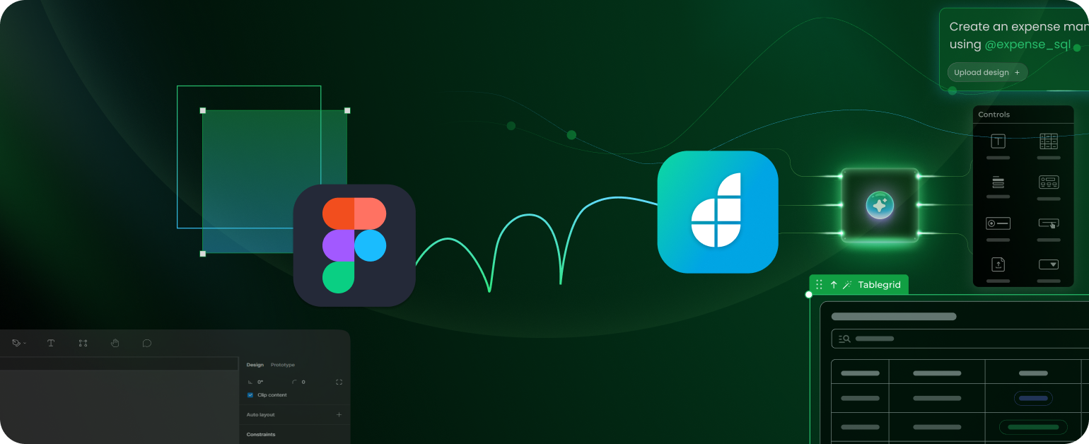
How it works: Figma to DronaHQ
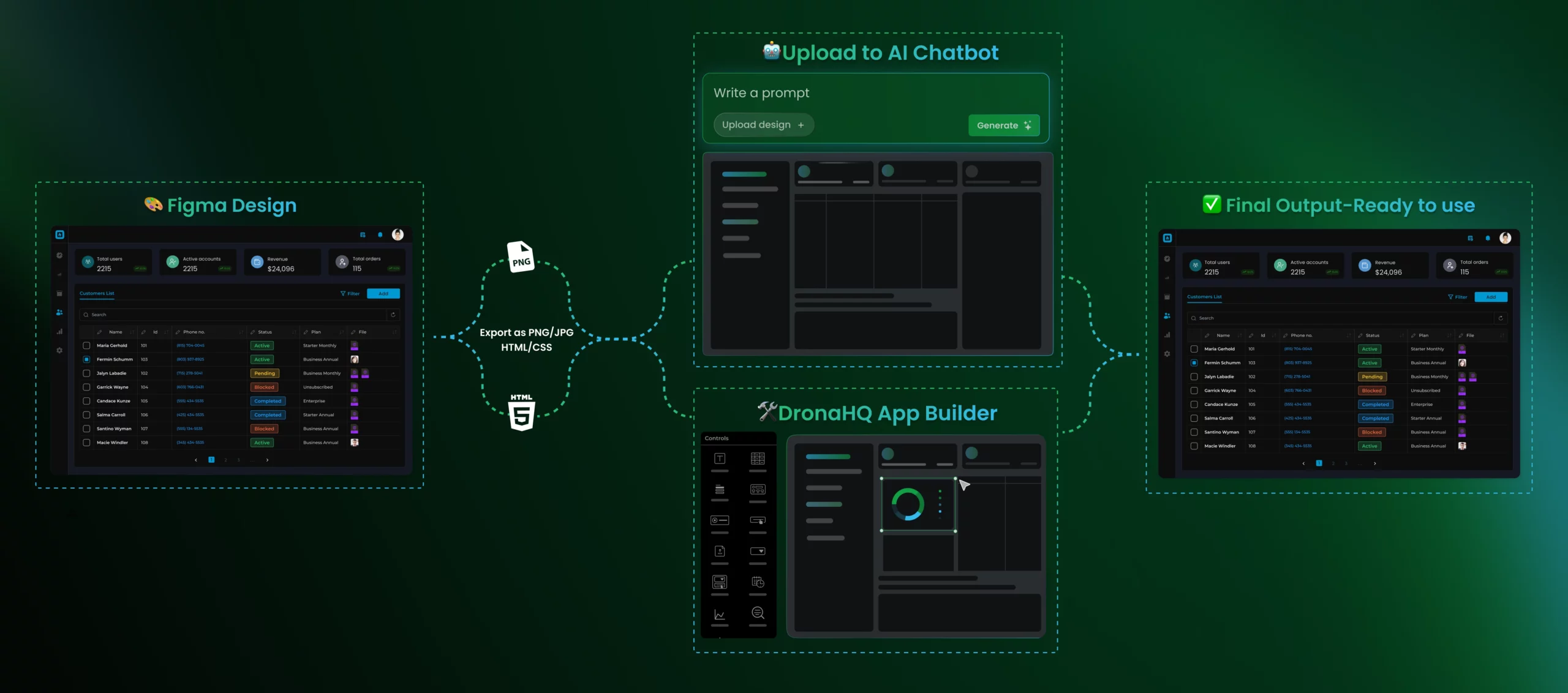
Upload designs into DronaHQ apps
The process is refreshingly straightforward:
- Customize the Figma kit. Access the official DronaHQ Design System here: Download Kit. Modify components: adjust branding, sizing, colors, fonts.
- Export screens or components. Once your design is ready, export your frames or individual components directly from Figma in any image file format.
- Upload via DronaHQ AI Chatbot. Upload your exported files to the DronaHQ AI Chatbot. These files are instantly converted into assets that you can use directly inside your app builder.
HTML/CSS export to Control Designer
While image uploads are fast and simple, for highly interactive UI needs (hover states, animations, dynamic forms), DronaHQ offers a powerful “Control Designer” feature.
Using plugins like Anima in Figma:
- Export clean HTML/CSS code from your designs.
- Import into DronaHQ Control Designer.
- Build truly dynamic, responsive controls.
Refer to this blog for full instructions: How to export Figma designs to HTML using Anima
Choosing between PNG uploads and HTML/CSS exports
When bringing your Figma designs into DronaHQ, you can either upload PNG images or export as HTML/CSS code. Each method serves different use cases depending on your design goals, skill level, and maintenance needs. Here’s a breakdown to help you decide:
| Feature | PNG Upload (Image) | HTML/CSS Export (Control Designer) |
| Best for | Static screens, banners, simple illustrations, or quick mockups | Interactive forms, hover effects, responsive layouts, or dynamic sections |
| Skill Level | Beginner-friendly — basic Figma export knowledge | Intermediate to advanced — HTML/CSS familiarity recommended |
| Hover Effects | ❌ Not supported — static visuals only | ✅ Fully supported — hover, active, and focus states via CSS |
| Maintenance Effort | Low — simply replace the image when needed | Medium — requires updating the code when changes are made |
| Mobile Responsiveness | Manual — needs layout tweaking inside DronaHQ’s app builder | Full — manage responsiveness using media queries and CSS techniques |
| Design Complexity | Unified — applies shared styling (colors, fonts) across multiple templates globally | Granular — design elements can have unique styles, spacing, and behaviors per component |
Quick tip: If you’re a designer or PM looking to get something live quickly with visual fidelity, PNGs will do the job. But if you’re a developer or working closely with one, HTML/CSS offers the flexibility and control needed for richer interactions and responsiveness.
Using the design kit right
- Before diving into high-fidelity screens, familiarize yourself with the foundational elements like typography, color styles, spacing guidelines, and grid layouts provided in the kit. This helps maintain consistency and saves time down the line.
- Stick to using the pre-built components (buttons, inputs, tables, etc.) from the kit instead of creating new ones from scratch. These components are optimized for DronaHQ’s frontend and reduce friction during handoff and implementation.
- Take advantage of component variants (like primary/secondary buttons, filled/outlined inputs) and configurable properties. This keeps your designs modular and reduces duplication in your Figma file.
- Regular check-ins with your dev team ensure designs remain feasible and aligned with DronaHQ’s capabilities. It also helps in identifying when to customize versus when to reuse existing components.
- While it’s tempting to push design boundaries, remember the goal is to build efficiently using low-code principles. Keep customizations minimal and purposeful to reduce development complexity.
Resources and quick links
DronaHQ Figma Design System Kit
DronaHQ Platform - Sign Up
DronaHQ Documentation - Working with AI Chatbot
Anima Plugin - Export Figma to HTML
Related Articles