
How to easily create charts on Airtable data using DronaHQ
Charts are a great way to represent your data in a visual form. They allow you to get an overall view of the information you have, quickly identify trends, and make important decisions.
Whether you’re a business analyst, market researcher, or just someone looking to better understand their data, charts can help you gain valuable insights into your data.
Now when we talk about charts, having structured data storage is the most important factor. One such tool is Airtable, it allows users to create a database, configure column types, connect tables, add records, sort records, collaborate, and publish views to external websites.
Many businesses across the world use Airtable to manage their data. However sometimes it becomes really difficult to make sense out of data when your business scales.
In this article, we will discuss the importance of data visualization, and how DronaHQ can help you build charts and make sense out of data on top of your Airtable database.
What is an Airtable dashboard?
A dashboard is an incredibly powerful way that can help you organize, visualize, and analyze your data in a streamlined and efficient way. It’s a great way to gain insights into your business operations and make informed decisions. With an Airtable dashboard, you can quickly create reports, charts, and graphs to help you understand your data and make better decisions. Additionally, you can also customize your dashboard to fit your specific needs and preferences. With its intuitive design and powerful features, an Airtable dashboard can help you unlock the potential of your data and make your business more successful.
Why is data visualization important?
With the rise of data-driven technologies, understanding the importance of visualizing your Airtable data is essential. Here are a few of the most notable:
Tracking KPIs
We primarily start creating dashboards to track our KPIs – be it for the sales and marketing teams, the warehousing department, the HR, or any other department. By tracking KPIs over time, it can help decision-makers understand what’s working and what isn’t, so they can make adjustments accordingly. In short, data dashboards are an invaluable tool for decision-makers as they provide a comprehensive view of the performance of their KPIs.
Uncover insights
By visualizing your Airtable data, you can uncover insights that would otherwise remain hidden in the depths of your data. For example, if amazon stops using data visualization they will never know from which region they are receiving the maximum amount of orders or what is the most selling product.
Identify trends
Identifying potential trends and relationships in your data may be useful for decision making.
Every ecommerce company keeps track of the most trending products using data visualization to make sure they arrange the maximum amount of quantity in stock.
Communicate beautifully
Visualizing your data can also help you communicate your findings to a larger audience in a more meaningful way.
Ultimately, visualizing your Airtable data is an important step in the data analysis process and can help you unlock insights and make better decisions.
Who can benefit from data visualization?
There are many specific use cases where data visualization can be particularly useful, such as in identifying market trends, analyzing customer behavior, and uncovering insights from financial data.
Some specific use cases are:
1. Sales data
2. Project management
3. Product roadmap
4. Inventory management
5. Customer support
6. Client portals
7. Lead management
8. Product revenue
9. Partner projects
Visualize your Airtable data using DronaHQ
DronaHQ offers ready-to-use charts UI control and a straightforward and intuitive drag and drop interface for visualizing data. With DronaHQ’s charting capabilities, you can now take your Airtable data to the next level. Not only can you create eye-catching visuals, but you can centralize and collate data from different sources and you can also effectively analyze, interpret, and share your data with ease. With DronaHQ, you can easily create a variety of charts, such as line, bar, scatter, and pie charts, to gain a better understanding of your data. Whether you’re looking for a quick overview or a detailed analysis of your data, DronaHQ makes it simple to create the type of chart that best suits your needs.
How to build Airtable dashboards with DronaHQ
Let’s look briefly at how can we create Airtable dashboard on DronaHQ
Step 1: Login or signup with DronaHQ
You have to first log in/sign up with DronaHQ to start creating Airtable dashboards. If you don’t have an account already, click here to sign up.
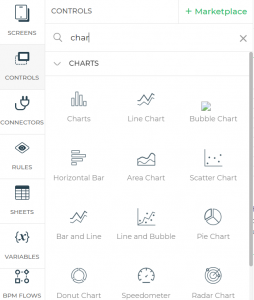
Step 2: Select chart control
From the controls section, select the chart you want to add to display your data. DronaHQ has many charts controls including bar graph, line chart, pie chart, scatter chart, horizontal bar and many more.
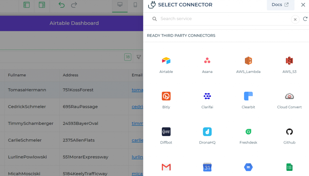
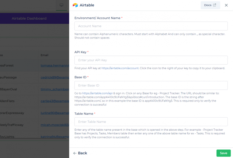
Step 3: Connect to Airtable connector
After selecting the chart control now connect the Airtable connector to your Airtable account. It requires information such as the API Key, Base ID, and Table Name, which are easily determined by the references provided for each field. After connecting the account now bind the Airtable data to the specific chart control.
Now select the action you want to perform. To fetch data for building charts you can select “Find rows” functionality.
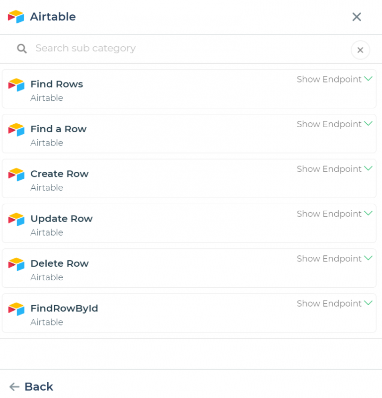
After selecting the “Find rows” now put the required keywords in the required fields.
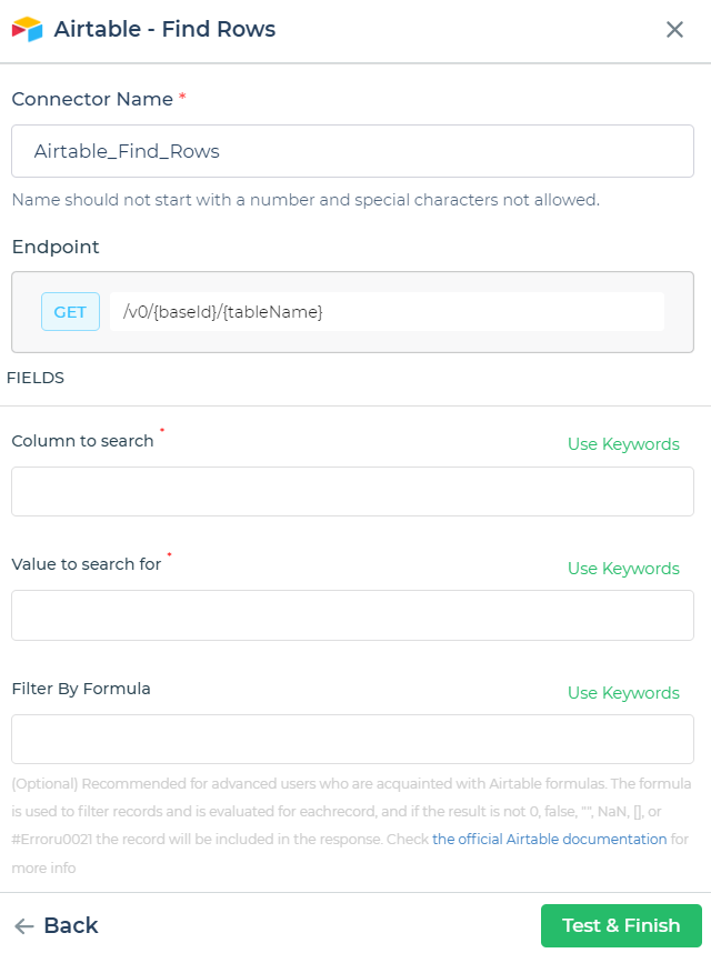
After selecting all the information now you can test and finish. And your data will be fetched to the charts control.
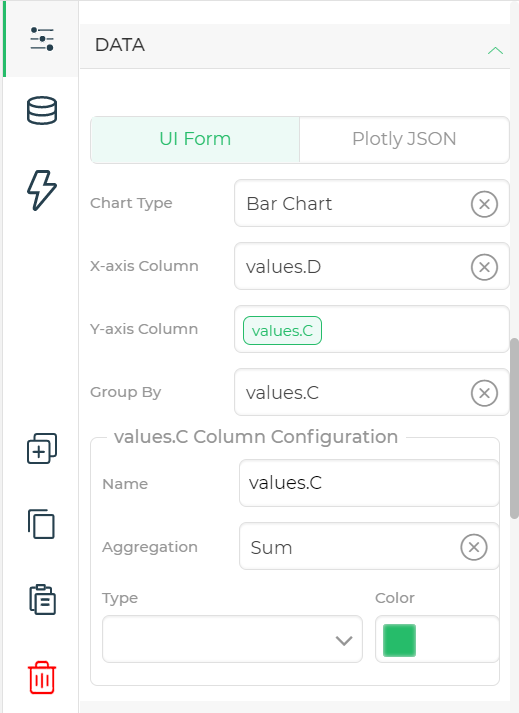
Step 4: Setup chart properties
After binding the Airtable data to the charts, now go to charts properties and configure your data. For example which type of graph you want to display, what data you want to display on the graph and on which axis etc.
Step 5: Preview and publish
You can run a preview and proceed once you have done adding the values and colours to the chart.
The same sequence can also be used to configure and customise more complex charts.
Why build Airtable charts with DronaHQ
By combining Airtable with DronaHQ’s charting capabilities, users are able to create powerful charts that can accurately and quickly visualize their data. With DronaHQ, users can select from a range of chart types, customize the look and feel of the chart, and even apply filters and sorting. With these advanced features, users can build data charts that are visually appealing, interactive, and easily shareable.
Since DronaHQ doesn’t need coding knowledge or technological skills and you can get started for free, it is considerably simpler than Airtable.
DronaHQ gives you:
Easy to use interface:
DronaHQ is perfect for everyone who wants to build charts because you don’t need any specialised skills and it comes with a drag and drop interface that makes it easy to visualise your data with it.
Role based access:
You can fix the accessibility of your data charts using rules and validations feature.
Dashboard view:
You can have thousands of rows and multiple chart views of multiple datasets on a single screen as DronaHQ gives you the ability to build interactive dashboards which makes it easier to visualize data and draw valuable insights out of it.
Ready UI controls:
DronaHQ comes with 150+ pre-built UI controls like table grid, text input, dropdown, action buttons and many more. For example, you can make notes using the text input, or you can perform certain actions using the button after visualization of the data.
Security:
DronaHQ provides enterprise-grade security that has been put to the test in numerous large enterprises. Also get safety features like SOC type II compliant, SAML SSO & 2FA, audit logs, on-prem deployment and also with secure embed allow only verified/logged in users to access the app’s link.
Web + Mobile output:
DronaHQ is responsive across devices, offering mobile (iOS and Android) and web output.
So don’t let your data sit idle—start using DronaHQ’s easy-to-use charting features to get the most out of your data.
Signup for free to get started!
Related Articles