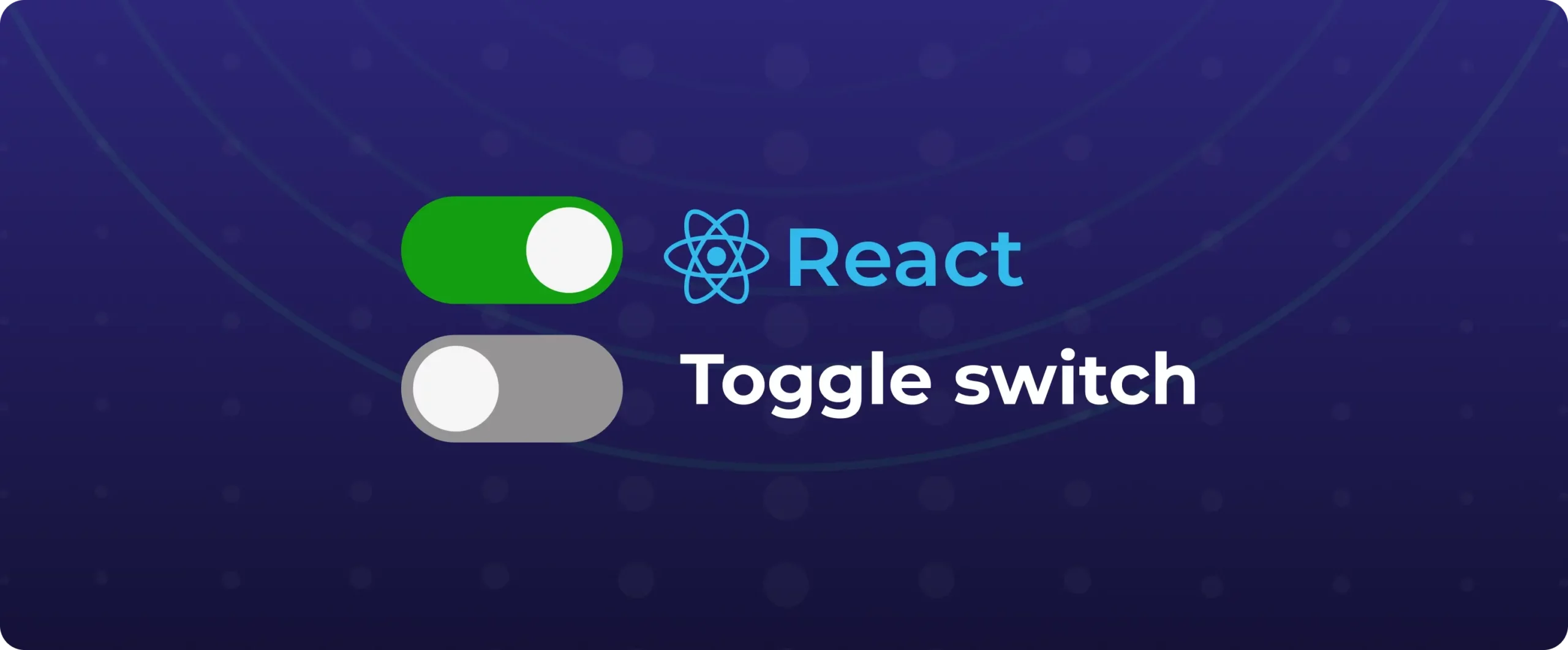

How to build a custom React toggle switch component
If you’ve worked on React projects, you’ve undoubtedly encountered situations where a switch was necessary. Recently, while working on a project, I needed a simple boolean switch for setting panels. I had two options: either use the built-in HTML checkbox or grab a component from a UI framework like Radix or Material UI. But I chose to build my own React toggle switch from scratch.
I chose to build my own switch because I wanted complete control over the behaviour and style, something portable and lightweight for usage in a variety of projects, and, the reality is, I simply enjoy the challenge of creating things from the ground up.
What is a toggle switch?
A switch is a component that is used to switch between two states, usually enabled and disabled, true and false, or on and off. While it functions similarly to a checkbox, it is frequently designed to resemble a sliding toggle, which makes it more aesthetically pleasing and intuitive for binary choices.
Why use a toggle instead of a checkbox?
React toggle switches are preferred over HTML checkboxes for the following reasons:
- The setting takes effect instantly (e.g., dark mode, mute/unmute)
- The user doesn’t need to approve or complete a form.
- We get more visually intuitive interaction.
Compared to checkboxes, toggles offer a better user experience and more lucid feedback for on/off actions.
We commonly see toggle switches on daily-basis, being used for:
- Dark mode switch – To enhance accessibility, a toggle button is frequently positioned in the top navigation bar to enable users to swiftly switch between dark and light themes.
- Notifications preference – In many applications, users can control their alert settings using toggle switches. For example, enabling weekly email digests or push notifications.
- Privacy preferences – Users can easily control their privacy by using React toggle switches in user profile sections to change visible options like “Show my email” and “Make profile public.”
What a React toggle switch require
A standard toggle switch comes to be not without:
- Boolean state – You’ll need a true/false value to control the switch state, like “useState”.
- Toggle handler – A function to flip the state when the user interacts with the switch.
- Component props – Accept props like value, onClick, and optionally, custom colours or labels.
- Styling – Define styles for the track and handle, including animation for smooth transitions.
- Accessibility – Use ARIA roles (role=”switch”, aria-checked) and support keyboard navigation.
- Optional enhancements – Add hidden checkboxes for screen readers or support callbacks like onTrue/onFalse.
Steps to create a React toggle switch
Step 1 – Create a new file ToggleSwitch.jsx
import React from 'react';
import './ToggleSwitch.css';
const ToggleSwitch = ({ isOn, handleToggle, onLabel = "On", offLabel = "Off" }) => {
return (
<div className="toggle-container">
<span>{offLabel}</span>
<div
className={`toggle-switch ${isOn ? 'toggle-on' : ''}`}
onClick={handleToggle}
role="switch"
aria-checked={isOn}
tabIndex="0"
onKeyDown={(e) => {
if (e.key === 'Enter' || e.key === ' ') handleToggle();
}}
>
<div className="switch-handle"></div>
</div>
<span>{onLabel}</span>
</div>
);
};
export default ToggleSwitch;In the above block of code, it defines a reusable Toggle Component
With props:
- isOn: A boolean that controls whether the switch is in the “on” (true) or “off” (false) state. It affects the styling through a CSS class.
- handleToggle: A function triggered when the switch is clicked. It toggles the state, usually handled in the parent component.
- onLabel / offLabel: Optional text shown next to the switch to indicate its current state. Defaults to “On” and “Off” but can be customised.
Accessibilities:
- role=”switch” announces the component to screen readers.
- aria-checked={isOn} tells assistive tech the current toggle state.
- tabIndex=”0″ makes the component focusable via keyboard.
- onKeyDown allows toggling with keyboard keys (Enter or Space).
Step 2: Create a file ToggleSwitch.css to style the switch
.toggle-container {
display: flex;
flex-direction: column;
align-items: centre;
font-family: sans-serif;
gap: 8px;
}
.toggle-switch {
width: 80px;
height: 40px;
background-color: #1e88e5;
border-radius: 20px;
position: relative;
cursor: pointer;
transition: background-color 0.3s ease;
}
.switch-handle {
width: 36px;
height: 36px;
background: white;
border-radius: 50%;
position: absolute;
top: 2px;
left: 2px;
transition: left 0.3s ease;
box-shadow: 0 1px 3px rgba(0, 0, 0, 0.3);
}
.toggle-on .switch-handle {
left: 42px;
}
This CSS produces a React toggle switch with a bright blue background and a smooth-sliding white circular handle with
- .toggle-switch: Base styling of the switch track with a blue colour and rounded corners.
- .switch-handle: Circular white knob that slides left/right based on state.
- .toggle-on .switch-handle: Moves handle to the right when the toggle is on.
Step 3: Use the React Toggle Switch in your main app like this:
import React, { useState } from 'react';
import ToggleSwitch from './ToggleSwitch';
const App = () => {
const [isToggled, setIsToggled] = useState(false);
const toggleHandler = () => setIsToggled(prev => !prev);
return (
<div style={{ padding: 20 }}>
<h2>Dark Mode: {isToggled ? 'Enabled' : 'Disabled'}</h2>
<ToggleSwitch isOn={isToggled} handleToggle={toggleHandler} />
</div>
);
};
export default App;
In the above code we are using the Toggle Switch component that we created in previous steps. The state changes from true to false when the user presses the switch. The ToggleSwitch component manages the visual and interaction logic for the toggle switch user interface & toggleHandler flips the boolean value when the user interacts.
Think about enclosing the toggle switch in a separate NPM package or Storybook component if you find yourself utilizing it in several projects. In this manner, it may be reused by your whole team using standard design tokens.
Step 4 : Adding Animations (optional)
The user experience can be substantially improved by transitions. The handle already has a simple slide effect because we added transition to its location and backdrop color. However, we can go farther:
- Spring-like Bounce Effect (CSS)
We can simulate a bounce by adjusting the easing function:
transition: left 0.3s cubic-bezier(0.34, 1.56, 0.64, 1);- Color Fade Animation
Use transition: background-color 0.3s ease-in-out; on the .toggle-switch class to smooth out the color change. - Glow on Active
We can add a glow or shadow when toggled:
.toggle-on .switch-handle {
box-shadow: 0 0 8px rgba(33, 150, 243, 0.6);
}
Step 5 : Handling edge cases
- Disabled State:
Add a disabled prop to prevent interaction when needed. - Async/Loading:
Show a spinner or block toggle until an async operation completes. - Validation/Error:
Wrap toggling in a try/catch if connected to external actions (like APIs).
const toggleHandler = async () => {
try {
await updateSettings(!isToggled);
setIsToggled(prev => !prev);
} catch (err) {
console.error("Toggle failed:", err);
}
};
- A robust toggle handler for real-world use cases.
- Attempts to update the setting asynchronously (e.g., an API call).
- If successful, updates the toggle state.
- If it fails, logs an error (could also show a toast/notification).
Other enhancements you can try
- Add icons inside the toggle (like a moon/sun for dark mode)
- Add loading or disabled states for async actions
- Add sound feedback for accessibility
Final Thoughts
To be honest, creating this served as a wonderful reminder that not all components require a third-party library. Building tiny, reusable components like this from scratch is made simple by React’s composability. Additionally, it provides complete control over their appearance and behavior.
Try it out if you’re working on a project that requires a toggle; you’ll discover a lot and it may end up becoming one of your favorite components to reuse.
That said, if you’d rather move faster or focus on more complex logic, you can also use DronaHQ’s ready-to-use toggle switch component. It comes pre-built, fully customizable, and is part of a larger set of UI components designed to help you build apps visually. With DronaHQ’s visual builder, pre-built logic, and AI-powered scaffolding for React-style UIs, you can ship internal tools in hours, not weeks. Try it free or explore the component library to see what’s possible.
Related Articles