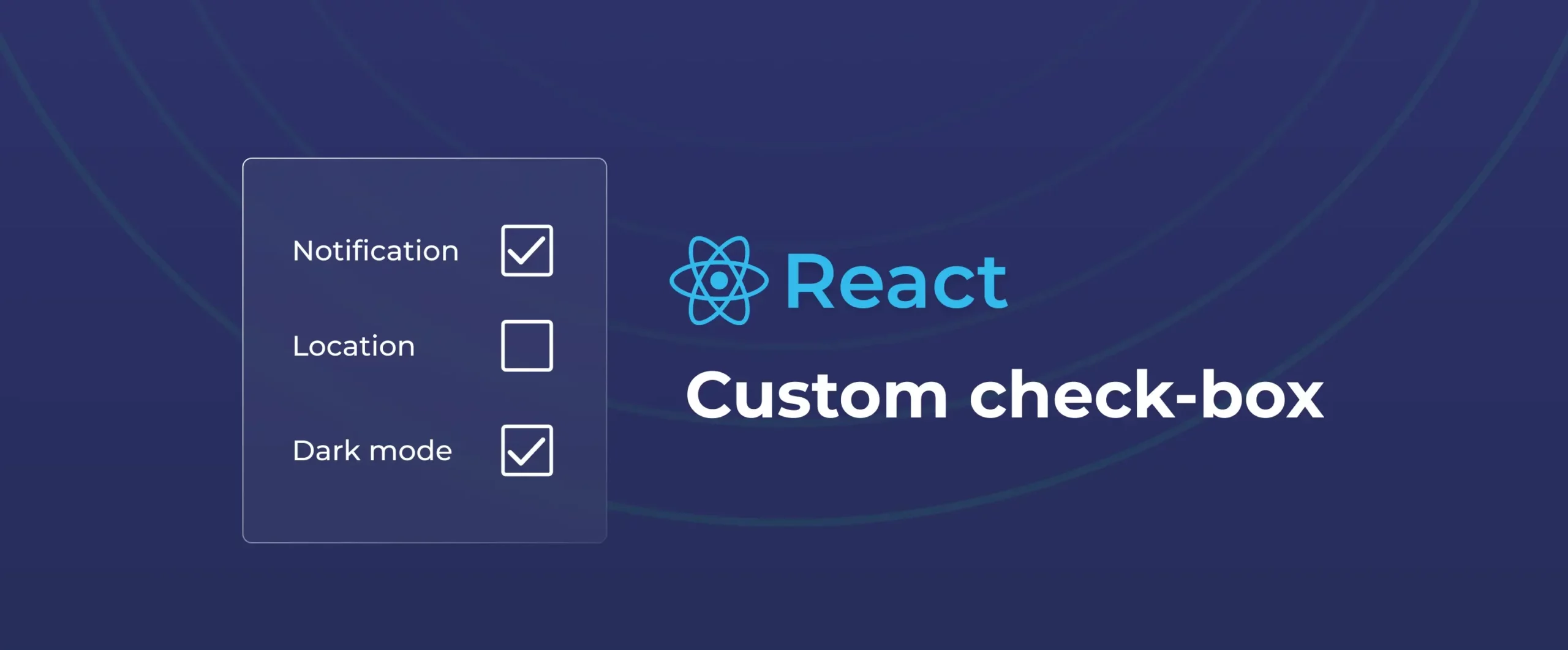

How to build a custom checkbox in React (with hooks & styling)
Developing reusable components can significantly speed up development when using the popular React library. Tables and nav bars are frequently regarded as vital UI elements, and in this article, we’ll learn why the React checkbox deserves a spot alongside them and how to create a React checkbox component using current best practices and modern conventions.
Understanding React checkbox
A React checkbox is a reusable component built in React that visually represents a boolean state, either checked (true) or unchecked (false). Just like an HTML checkbox, they’re perfect for user interactions like selecting options or toggling settings. But in React, these checkboxes become more powerful.
It has never been easier to create a unique, stylish checkbox this easily, thanks to the newest React features, such as functional components and hooks.
Why use React checkbox
Using a React checkbox instead of a plain HTML checkbox brings better control, reusability, and integration into modern applications. React checkboxes work well with React’s one-way data flow, making it easier to keep the UI and app logic in sync.
Additionally, these checkboxes support hooks, so you can trigger side effects or async actions easily, something that’s harder to do with regular HTML checkboxes. They also support advanced features like controlled components, custom styling, and even indeterminate states for partial selections.
- Hooks Integration
React hooks such as useState and useEffect can be used to trigger side effects, manage form submissions, or respond to user interactions in real time, something not easily possible with plain HTML. - Controlled Components
React checkboxes can be controlled via state, meaning the UI is always in sync with your app logic. You decide when it’s checked or not, instead of relying on the browser’s internal state. - Custom Styling
With React, you can apply completely custom styles or even animations to checkboxes, giving you more flexibility than the default browser styles.
- Reusability
We can code this checkbox once as a component and reuse it across your app. Simply pass in different props such as checked, onChange, label, and you’re good to go.
- Support for Complex States
React lets you easily handle more advanced states like indeterminate (partially checked), which is useful in multi-select lists or parent-child checkbox groups.
- Improved Testing and Debugging
These checkboxes are easier to test in unit tests because their behavior is declarative and driven by props/state, not just DOM (Document Object Model) events.
- Form Library Compatibility
They integrate smoothly with React form libraries like Formik, React Hook Form, or Redux Form, making form-building much easier.
Right way to build a checkbox in React
Although Checkboxes might seem simple, even small UI elements deserve thoughtful structure in React. We will use React hooks, props, and a little CSS flair to create a completely customisable checkbox component. With this method, your checkboxes will be clear, adaptable, and reusable whether you’re creating a form or changing settings.
Step 1 – Managing State
To manage state, React offers the useState hook. In this instance, we will pass in the state as props and declare it outside of the checkbox component. This keeps our components under control, which is perfect for constantly handling form data and behavior.
const App = () => {
const [isChecked, setIsChecked] = useState(false);
return <Checkbox checked={isChecked} onChange={setIsChecked} />;
};
Step 2 – The Input Element
Let’s wrap a native HTML checkbox inside a React component and connect its checked and onChange props to state.
const Checkbox = ({ checked, onChange }) => {
return (
<input
type="checkbox"
checked={checked}
onChange={() => onChange(!checked)}
/>
);
};
Step 3 – Use onChange instead of onClick
Although using onClick might appear simple, onChange catches other use cases, such as screen readers and keyboard interaction. For form elements, it is more approachable and suggested in React.
Step 4 – Adding a Label
Labels help you interact with your checkboxes more easily and aren’t just for accessibility. The label text will be set by the parent using the native element.
const Checkbox = ({ checked, onChange, label }) => {
return (
<label>
<input
type="checkbox"
checked={checked}
onChange={() => onChange(!checked)}
/>
{label}
</label>
);
};
Step 5 – Making it form-ready
If you need your checkbox inside a form, add a name prop so it integrates smoothly with form submissions.
const Checkbox = ({ checked, onChange, label, name }) => {
return (
<label>
<input
type="checkbox"
name={name}
checked={checked}
onChange={() => onChange(!checked)}
/>
{label}
</label>
);
};
Step 6 – Adding Style with Custom CSS
To make our checkbox appear more like the theme of your app and less like the default browser UI, we’ll now extract the component and add a little CSS
import "./Checkbox.css";
const Checkbox = ({ checked, onChange, label, name }) => {
return (
<label className="checkbox">
<input
type="checkbox"
name={name}
checked={checked}
onChange={() => onChange(!checked)}
/>
{label}
</label>
);
};
export default Checkbox;
Adding CSS
label.checkbox {
display: flex;
align-items: center;
gap: 8px;
font-weight: 500;
}
label.checkbox input {
width: 18px;
height: 18px;
cursor: pointer;
}
Step 7 – Adding Animation (optional)
Once your checkbox is working and styled, you can take the user experience higher by adding subtle animations. This can make them feel more responsive and polished.
You can use plain CSS for simple effects or reach for animation libraries like Framer Motion if you want more control. Below are some examples of checkbox Designs –
Final thoughts
Building tiny, reusable components like this from scratch is made simple by React’s composability. Additionally, it provides complete control over their appearance and behaviour.
Try it out if you’re working on a project that requires a checkbox; you’ll discover a lot, and it may become one of your favorite components to reuse. There are more such components, such as a toggle and more. Click the link to know more about them.
That said, if you’d rather move faster or focus on more complex logic, you can also use DronaHQ’s ready-to-use toggle switch component. It comes pre-built, fully customizable, and is part of a larger set of UI components designed to help you build apps visually. With DronaHQ’s visual builder, pre-built logic, and AI-powered scaffolding for React-style UIs, you can ship internal tools in hours, not weeks. Try it for free or explore the component library to see what’s possible.
Whether you roll your own or use DronaHQ’s ready-made toggle component, understanding how checkboxes work under the hood helps you build better forms. The best UI components are the ones you understand, even when you don’t have to reinvent them.
Related Articles