Top React component library
Best React UI component library – our picks of 2023
According to Statista, React is the second most used web framework in the world as of 2022.
Makes sense as it helps users create stunning interfaces, without having to write long lines of code, making the process of development so much easier and fun.
Stay with us as we discuss the basic concepts of React UI component libraries and list the best ones.
What are React UI component libraries?
React UI Component UI libraries are tools, software systems, or resources offering a variety of ready-to-use and reusable components intended for React-based applications and sites. These libraries contain numerous elements such as buttons, input icons, navigation menus, data grids, forms, and more for developing an effortless user experience.
React UI component libraries make app development a whole lot easier saving both time and effort of developers. You can just import the necessary parts, configure them the way you want with the desired attributes and create the UI. It guarantees that components are uniform and well-crafted across the application while offering speed.
UI libraries are a great tool for boosting the accessibility of an app. They contain components that have been built to meet the Web Content Accessibility Guidelines (WCAG), making inclusivity a primary criterion to help even people with disabilities to use the application. This also fulfills legal requirements while making the app accessible to everyone.
Should you use a React UI component library?
React component library offers a wide range of selections, from small sets of basic components to expansive libraries with hundreds of components. They are a powerful tool enabling the development of high-quality user interfaces in React. Like every other instrument, it has its pros and cons too. But here is why we think it is worth giving a try-
Accelerated prototyping
When you have ready-made components in your hands to play with, it gets easier to create several functioning prototypes at speed. This implies that without spending too much time on creating details, you can prove whether the design concept is viable or not.
Beginner friendly
Prebuilt and ready-to-use components of UI libraries like buttons, form fields, etc make it easily accessible and beginner friendly. Since you don’t have to create any of the components from scratch, you can focus on the implementation and customization with the help of documentation.
Compliant with the latest standards
As previously mentioned, the components of the React Component UI Library are compliant with the latest accessibility standards like Web Content Accessibility Guidelines (WCAG) making it more inclusive and welcoming.
Compatible across devices
Most of the prebuilt UI components are mobile and web responsive by default. This means you don’t have to worry about your React project running on different types of devices (iOS and Android)
Advantages of using a React UI component library
Here is how you can benefit from using a React UI component library-
Rapid development
Using a React UI component library guarantees a faster development time. You can make use of several libraries from Material UI, Semantic UI, and Chakra UI to React Bootstrap, and more. You can visit their website to explore multiple, ready-to-use components and choose the one best suitable for your design. This makes software development a lot faster and easier.
Stunning UIs
Don’t think that you have to compromise on the look of your website just because you are building faster. Your website design plays a vital role in attracting and retaining customers. Fortunately, you can create and customize the look and feel of your website with out-of-the-box components offered by the UI libraries.
Don’t build from scratch
As already mentioned, you can code faster using prebuilt components. That means you can focus more on functional tasks instead of spending time coding for common elements. Using libraries will simplify your design process to a whole new extent, encouraging subject matter experts or business users to try their hands on software development without feeling overwhelmed.
Cross-browser compatibility
Developing CSS that works with all browsers is not easy. One mistake can impact the entire user experience. UI component libraries can be a strong solution for this. Most popular libraries offer great cross-browser compatibility, making it easier to enhance the user experience by letting them use any browser of their choice.
Top React UI component libraries for 2023
Material-UI
MUI is a popular library offering a user-friendly and visually appealing interface to deploy new features at speed. It features a wide range of pre-designed components and follows the guidelines of Google’s Material Design. Its support for accessibility, server-side rendering, internationalization, and regular updates makes it a reliable option.
MUI’s components are keyboard navigable and accessible to a wide range of users including those with disabilities. This library has a large community of developers, so you can easily get help and guidance whenever you need it.
Key Features
1. MUI offers powerful and flexible components that enable you to customize the look and feel of your project.
2. Offers simple and straightforward integration with other libraries and tools, such as Redux and React Router.
3. Offers good documentation and support.
4. MUI is free and open-source, which makes it easily accessible to developers of all levels and budgets.
Ant Design (AntD)
Ant Design’s components are built to offer users a consistent user experience, boasting multiple features to create appealing digital products. It offers components for navigation, forms, data display, and more.
Ant Design focuses on accessibility and is used by companies like Alibaba, Baidu, Tencent, and many more. All components are keyboard navigable and accessible making it easy to use by everyone while also offering built-in accessibility testing tools.
Key Features-
1. Offers multiple sets of pre-constructed elements such as buttons, forms, symbols, and other items.
2. Features a straightforward and uncomplicated API, making it easy to adapt to your web application.
3. Offers an extensive set of customization tools.
4. Well-documented with clear and concise instructions on how to use each component.
5. Regularly maintained and fixed bugs.
6. Free and open-source accessible to all types of users.
React Bootstrap
React Bootstrap stands out in terms of simplicity and responsiveness. It is a popular library offering an extensive selection of pre-configured elements designed to fit the look and feel of Bootstrap. You can develop your project using simple, responsive, mobile-first components without needing to create CSS from the beginning.
Using React Bootstrap will provide a consistent look and feel to your application, while you can still customize the appearance of individual components. You can easily change the colors and styles of your application to fit your brand aesthetics.
Key Features –
1. Compatible with a wide variety of UIs and pre-made elements including buttons, menus, forms, and more.
2. Users can enhance the performance of their applications through server-side rendering.
3. Straightforward and user-friendly UI making the process of development smooth and effortless.
4. Actively maintained and scanned for bugs.
5. Accessible and inclusive to all kinds of users.
6. Free and open-source
Chakra UI
Chakra UI offers accessible and composable React components enabling developers to quickly build user interfaces. It is highly customizable while incorporating the best practices for a11y, color accessibility, motion, and more.
You can utilize Chakra UI if you are looking to build modern and user-friendly applications. Like other options in the list, Chakra UI also focuses on accessibility and usability. All its components are well crafted to meet the necessary accessibility standards offering built-in testing tools to guarantee accessibility.
Key Features-
1. Features a wide range of ready-made elements.
2. Simple and straightforward API making it easier to understand and incorporate responsive parts into your program quickly.
3. Well documented with a community of developer support and extensive directions.
4. Free and open-source.
5. Easy-to-use interface and navigation allow you to find each feature easily.
Blueprint
Blueprint features over 40 modern-day components in its library. It is built on 88.9% TypeScript, 8.2 % SCSS, 2.2% Javascript, and 0.7% unspecified code.
Blueprint’s core package includes all the fundamental components. You can also add any additional component depending on your requirements.
Blueprint doesn’t feature prebuilt themes, except for the default light theme and a dark mode theme. But don’t worry, there is still enough room for customizing and building your themes like classes, color themes, and typography allowing full personalization.
Key features-
1. Offers a complex UI to allow developers to build heavy, feature-rich web interfaces.
2. Offers 300+ modifiable icons, interact with time and date, choose time zones, etc.
3. Easily accessible. You can easily install it through npm in the command prompt.
4. It offers features such as pixel streaming, capturing mixed realities, multi-user editing, creating magic leaps, panoramic capture, and more.
Fluent
Fluent is designed to help developers build modern, feature-rich interfaces. It is based on Microsoft’s Fluent Design System offering a range of components that can be used to create engaging and visually appealing user interfaces.
Fluent is a powerful and intuitive tool enabling users to add design elements without having to create from scratch and is compatible across devices be it PCs, mobile, or tablets.
Key features-
1. Features a flexible and modular architecture that can be easily customized to fit any project.
2. Explicit documentation and a vibrant community of developers.
3. Supports client-side and SSR.
4. Features a modern and visually appealing interface.
5. Works well with other Microsoft technologies like SharePoint and Power Apps.
Semantic UI
Semantic UI is used by more than 132,000 on GitHub. It is the official React integration of the Semantic UI development framework known for its responsive, human-friendly HTML code.
There are multiple variations of each component in this library. Whenever choosing the Semantic UI library, keep in mind that you might have to put in some extra work as all the components are not fully accessible by default.
But on the bright side, it is a good choice for beginners and has a human-friendly code and extensive documentation.
Key features-
1. Straightforward and user-friendly APIs.
2. Accessible and usable by all kinds of developers.
3. Comprehensive design system featuring typography, icons, and other components.
4. Actively maintained and bugs resolved to make it dependable.
Reactstrap
Reactstrap offers straightforward and self-contained components for Bootstrap 5.1. It offers great flexibility and prebuilt components excellent for building responsive websites with a great user experience.
Reactstrap focuses on simplicity and ease of use offering a simple and intuitive API, making it easy to add responsive components to your application. It is also well-documented with clear and concise instructions.
One of the great benefits of Reactstrap lies in its ability to integrate seamlessly with other React libraries and tools. That means Reactstrap components can be used in combination with other UI libraries such as Material-UI or Ant Design.
Key Features-
1. Beginner friendly – easy to understand and work with.
2. Free and open source – accessible to developers of all kinds.
3. Modern, intuitive, and user-friendly interfaces.
4. Lightweight and efficient with minimal dependencies.
5. Well documented and supported with explicit instructions.
6. Extensive customization options, allow you to change the look and feel of your app according to your needs and requirements.
React-admin
React framework is a great option if you are looking to build B2B applications. It is an open-source tool with an MIT license and is robust, stable, and easy to learn
Whether you are building your internal tools, B2B apps, CRM or ERP, working with this library will offer you an effortless experience. Around 10k+ companies worldwide have used React-admin on their projects.
Key features
1. Modern design with prebuilt components.
2. Offers numerous options for theming your project.
3. Accessible and responsive to anyone using different devices.
4. Works with any API.
5. Features two editions – community edition (free) and enterprise edition.
Blueprint
Blueprint is created by an American technology company specializing in big data analytics, in Palantir. The library features over 40 modern-day components, optimized for complex, data-rich desktop application interfaces. Since the focus is more on desktop applications, it is not fully mobile-responsive.
The Blueprint package has all the fundamental components and additional component packages depending on your specific needs. Blueprint offers only the default light and dark theme modes with no other pre-built themes. But you can easily customize classes, color themes, and typography to determine the type and feel of your interface.
Key features-
1. The library supports different types of browsers such as Chrome, Safari, etc.
2. Has detailed documentation for every aspect of its functionality.
3. User-friendly and beginner-friendly options.
4. Great for web applications, but not very suitable for mobile apps.
Choose DronaHQ for pre-built React-like components
DronaHQ is a low code platform for building interactive frontend UIs super conveniently at speed. You or anyone from your business team can build the application of your dreams in just a few clicks. You can also code if you want to, it is optional! Here are some more reasons to convince you why DronaHQ is a smart option for you –
Save hundreds of hours with ready UI components
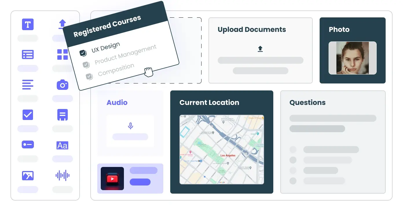
DronaHQ provides a complete set of building blocks to build powerful React apps. It includes-
- Text components can be used statically as labels or dynamically display values.
- Text Input takes input from the user and is commonly used to modify the parameters of a query.
- Buttons to trigger actions that do things like run queries, export data, or open other apps.
- Table to display the output of a query. You can also control their look and the visible columns.
- Containers to let you move components together and improve the layout.
And much more!
Personalize according to your needs and requirements
Customize and create new components with –
1. No code control designer- create your elements, provide states, write CSS, and more with a variety of options available at your fingertips.
2. Control editor – Bind components with data, hide or read-only components, and more to build a custom UI component for your project.
Autogenerate critical app screens like CRUD operations
Use our boilerplate code, 100+ pre-built components, and ready templates to customize your features while we take care of the crucial CRUD operations.
Connect to any data source
Connect to the databases of your choice, any APIs, and third-party apps like Salesforce, Slack, Stripe, Airtable, and much more!
User permissions
Manage how your team members interact with the components of your application with role-based access control and permission settings.
Hosting and deployment
Deploy an airtight self-hosted version of DronaHQ within your infrastructure and host-on prem.
Sign up now!
Related Articles