
12 Creative table UI design tips (2026)
Most enterprise apps don’t suffer from a lack of data. They suffer from poor data visibility. Dashboards are great for spotting trends. But when it comes to decisions and actions, tables win. This guide shares 12 best practices for designing effective table UIs, ones that help users interact with data, not just view it.
Skip the basics and find out our top 12 table UI design best practices.
What is a Table UI?
A table UI helps users read, explore, and act on data. All in one place. It’s more than rows and columns. It includes features like filtering, inline actions, formatting, and mobile responsiveness to give users true control center for data.
It is an interactive interface designed to convert raw data into actionable insights.
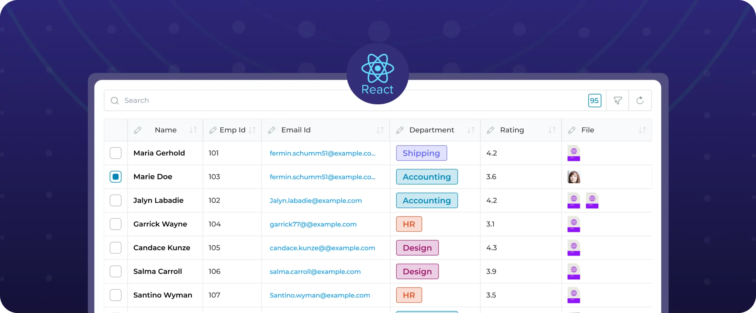
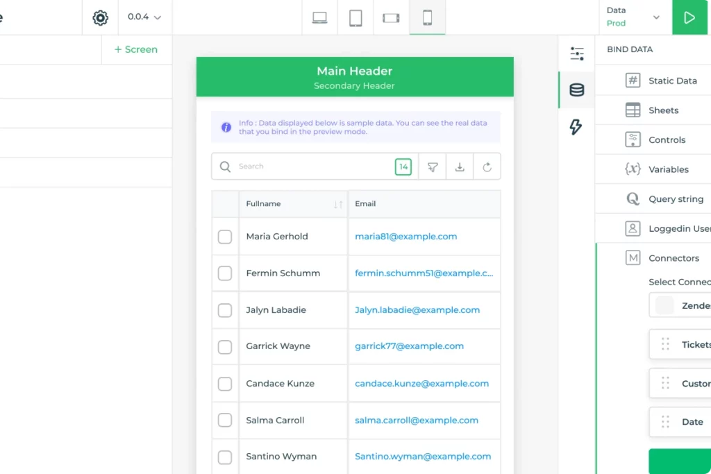
DronaHQ’s Table Grid UI is a prime example of this concept. It offers functionalities such as searching, sorting, filtering, and the option to download data in CSV format. This versatile tool transforms data into a meaningful and interactive format, empowering users to extract valuable insights and take informed actions.
When to use a table UI design?
Charts help you see patterns. Tables help you act on data. Use a table UI when:
- You have large datasets
- Users need to sort, search, or filter
- Inline actions or bulk operations are required
- Each row holds meaningful attributes or triggers actions
| Feature | Charts | Tables |
|---|---|---|
| Spot trends | ✅ | ❌ |
| Interact with rows | ❌ | ✅ |
| Perform actions | ❌ | ✅ |
| Handle large datasets | ❌ | ✅ |
| Suitable for mobile | ✅ | ✅ (with care) |
Data tables play a deceptively crucial role in user interfaces. Here’s why you need a good Table UI design:
- Good use of space: UI tables integrate data effectively, providing more space for additional design elements on the interface.
- Clean and neat layout: Table UI design organizes data, resulting in a cleaner and more straightforward layout for the page.
- Reducing design complexity: UI tables remove unnecessary information, simplifying page design and reducing overall complexity.
- Easy to modify: Table UI design allows easy customization, enabling users to understand and extract information effortlessly.
- Improve loading speed: Presenting data in a compressed manner within a UI table enhances loading speed by avoiding scattered information.
- Efficient use of interface space:Tables maximize web or mobile app interface space, allowing users to view a substantial amount of data without excessive scrolling.
DronaHQ table UI supports various data types for columns, ranging from text to date and time to geolocation. Applications of these data types that can be used in Table UI:
- Sales teams use tables to view leads and take actions directly from the UI (e.g., call, email)
- QA teams scan product URLs, ratings, and category tags
- Field teams use geolocation columns to view and navigate to inspection sites
What makes your Table UI effective?
Achieving an effective Table UI design goes beyond aesthetics. It involves understanding user needs, incorporating industry standards, and implementing best practices. This section explores the key elements that contribute to the success of a Table UI, setting benchmarks for optimal results.
- It allows users to read and search multiple database records at once.
- Display attributes that allow users to identify the right item for their needs.
- Allow users to perform actions on the desired rows. And control how different users interact with the same data.
Top 12 tips for designing a table UI
These tips will help you in building a better and more streamlined table UI for your users
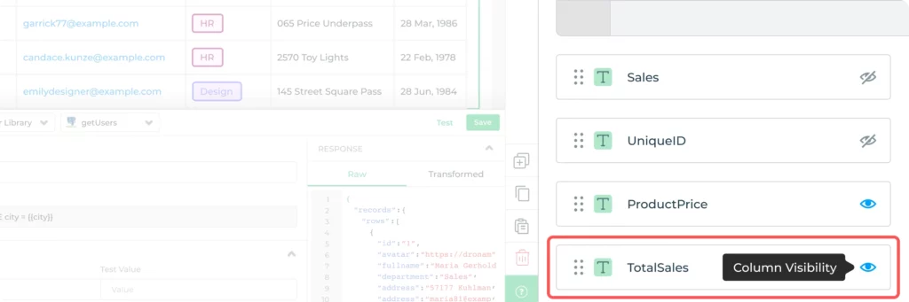
1. Simplicity: Choose less over mess
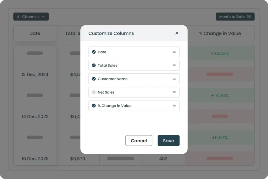
Problem: Too many visible columns can confuse users and bury important data.
Fix: Only show high-priority columns by default. Let users reveal more if needed via toggles or dropdowns.
Why it matters: It keeps the interface clean, reduces noise, and allows users to focus on the most relevant data at a glance.
Overloading users with so much information might make it difficult for users to capture the required information. Avoiding this will reduce the visual noise on tables. When designing tables, keeping the constraint of horizontal space in mind is crucial.
Display columns that are necessary, others can remain hidden and open up when the user interacts with the data set. Focus on key metrics aligned with user goals for a quick understanding without unnecessary details.
2. Make it user-friendly
Problem: Generic table designs ignore user workflows.
Fix: Design based on user roles, needs, and context. Include tooltips, summaries, or hide rarely-used data.
Why it matters: Users find what they need faster, making the UI more intuitive and efficient.
Irrespective of what your role/job is it is of very high importance to build anything or everything after understanding the end-users. The understanding of users comprises their preferences, pain points, and workflows.
That is, the design decisions which you will make will depend on how your tools are being used.
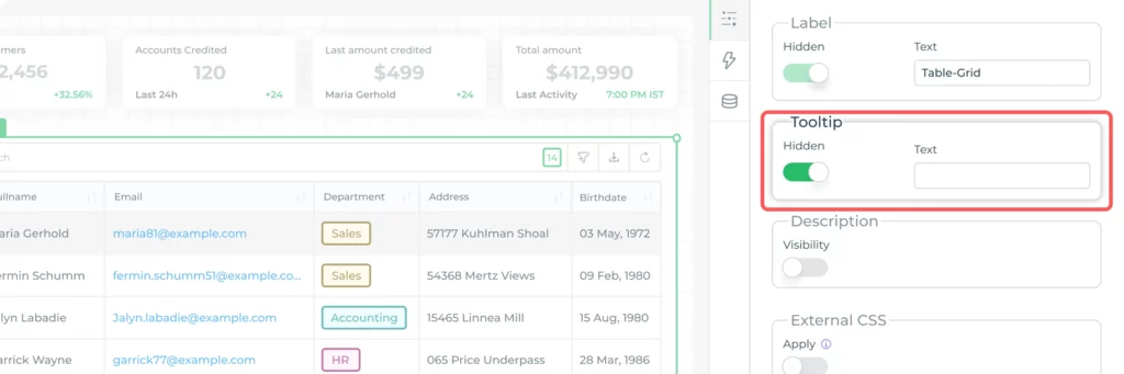
Consider tooltips for complex data to maintain a clean visual presentation while offering additional details when needed. Not every user will need every detail.
Design rich table UI in minutes
DronaHQ has the ready table UI control with custom styling features so you can deliver great end user experience
Get started for free →3. Scrollable vertically and horizontally
Problem: Large tables break UX with difficult navigation.
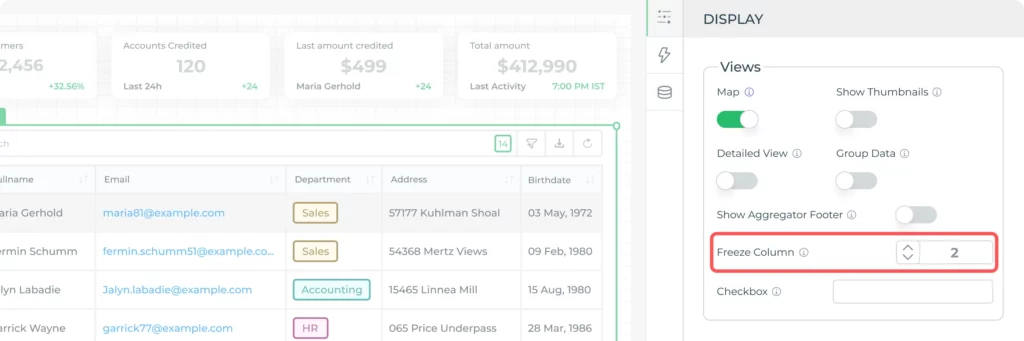
Fix: Enable horizontal and vertical scroll. Freeze headers or key columns.
Why it matters: Easier to explore datasets without losing context.
Ensure seamless navigation through horizontal and vertical scrolling, optimizing space for data presentation.
But don’t forget to freeze rows or columns that help users read data better.
4. Make it responsive
Problem: Tables don’t naturally fit small screens.
Fix: Limit visible columns, stack rows, or show detail views. Use responsive frameworks.
Why it matters: Mobile users can access the same insights without frustration.
Making table UIs for mobile devices is a bit complex. Usually, it is difficult to fit the table interface in a narrow-width layout. Displaying a table with more than 3 columns is possible only by horizontal scrolling which is a counterintuitive task in itself.
The possible ways to tackle this problem are: A. Limit the number of columns for mobile devices and B. Provide filters to show essential information
The Table UI you design in DronaHQ is by default mobile friendly and activates horizontal and vertical scroll.
We might set a condition to display fewer columns if a user uses a mobile device to access the table. Alternatively, we could build two entirely separate table UIs, and only display one or the other based on the current user’s device.
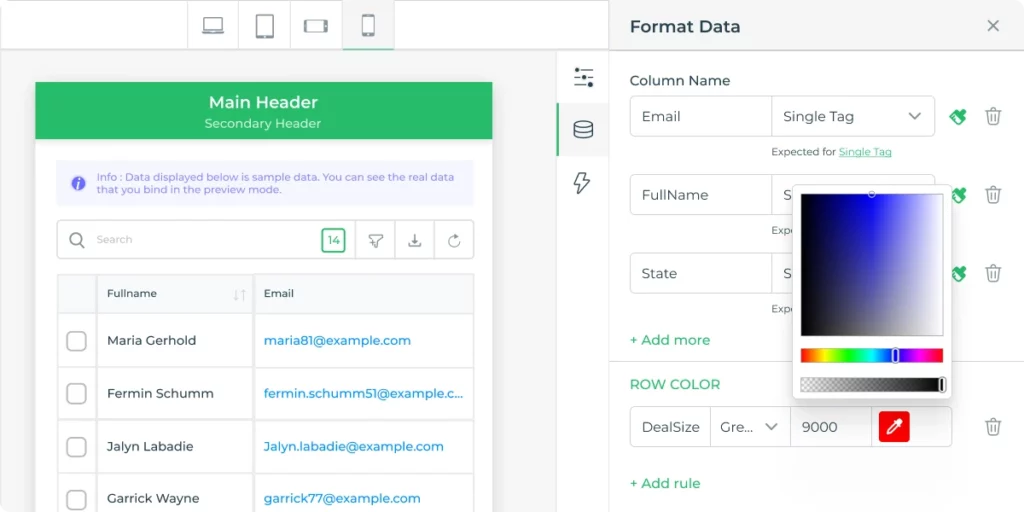
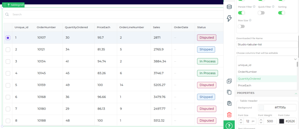
5. Set formatting properties
Problem: Inconsistent column styles increase cognitive load.
Fix: Apply uniform formatting. Use conditional styles for alerts or insights.
Why it matters: Improves scanability and clarity.
In Table UI design, a standardised format ensures a consistent structure, simplifying user interaction and enhancing comprehension. Consistency in column layouts reduces cognitive load, improving readability.
Leveraging conditional formatting provides dynamic visual cues for quick insights, while a clean and cohesive layout enhances the overall user experience.
This standardization facilitates easy data comparison within the table, supporting efficient analysis and decision-making.
6. Consider data load speed
Problem: Slow loading tables ruin the user experience.
Fix: Use lazy loading, pagination, and local caching. Limit initial fetch size.
Why it matters: Keeps interaction fast, even with large datasets.
Optimizing the speed at which data is loaded into the table enhances user experience by ensuring quick and responsive interactions. This involves strategies such as efficient data fetching, minimizing unnecessary data retrieval, and utilizing technologies like lazy loading to enhance performance.
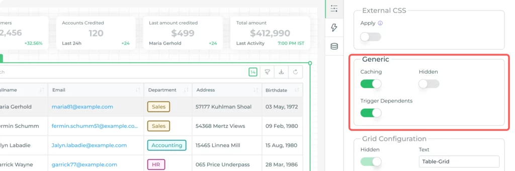
Caching is essential for optimizing data load speed. By retrieving data from a local cache rather than the server, the Table UI can deliver a faster and more responsive user experience. This is particularly beneficial when dealing with large datasets or when users interact with the table regularly, contributing to overall efficiency in data presentation and interaction.
Prioritizing data load speed contributes to a seamless and efficient user interface, especially when dealing with large datasets.
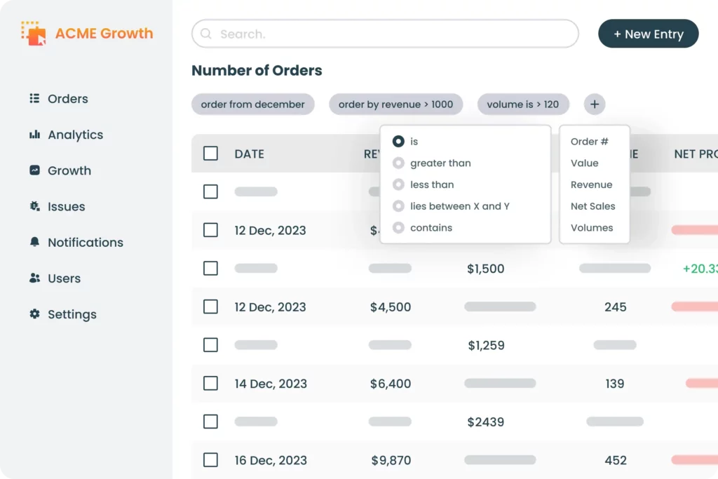
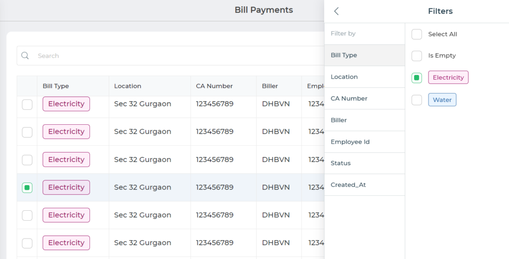
7. Cover Basics: Search, filter, sort
Applying filters before fetching data governs how data is retrieved from the large set of databases and displayed in Table UI. These can be based on user behaviour, back-end attributes, or any other factors the app handles.
For example, we might set a condition to display fewer columns if a user uses a mobile device to access the table. Alternatively, we could build two entirely separate table UIs, and only display one or the other based on the current user’s device.
We might display additional elements for users with higher access roles, or even hide different data at certain times of the day.
Additionally, you may also want to add functionality for end users to search through the rows of data displayed, apply filters to further condense the list of rows, and sort the rows by column of choice.
Design custom Table UI and delight end users – hyper personalized UI, easy integrations, role-based access: Build Table UI Design Free
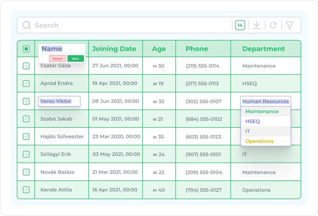
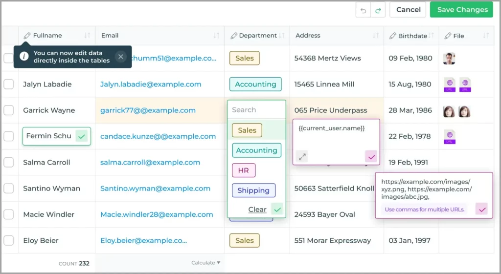
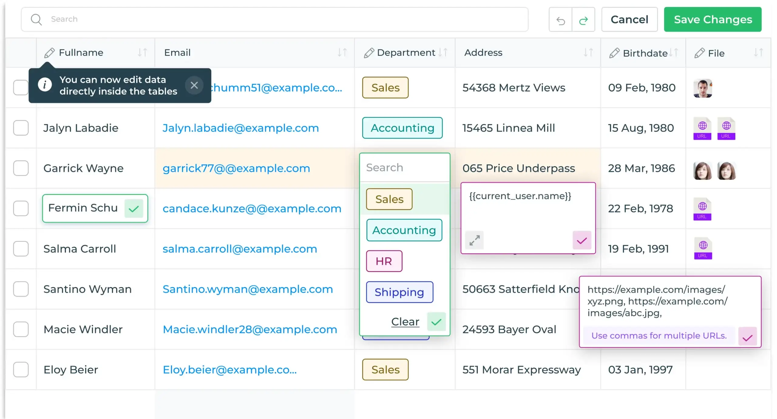
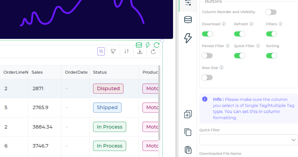
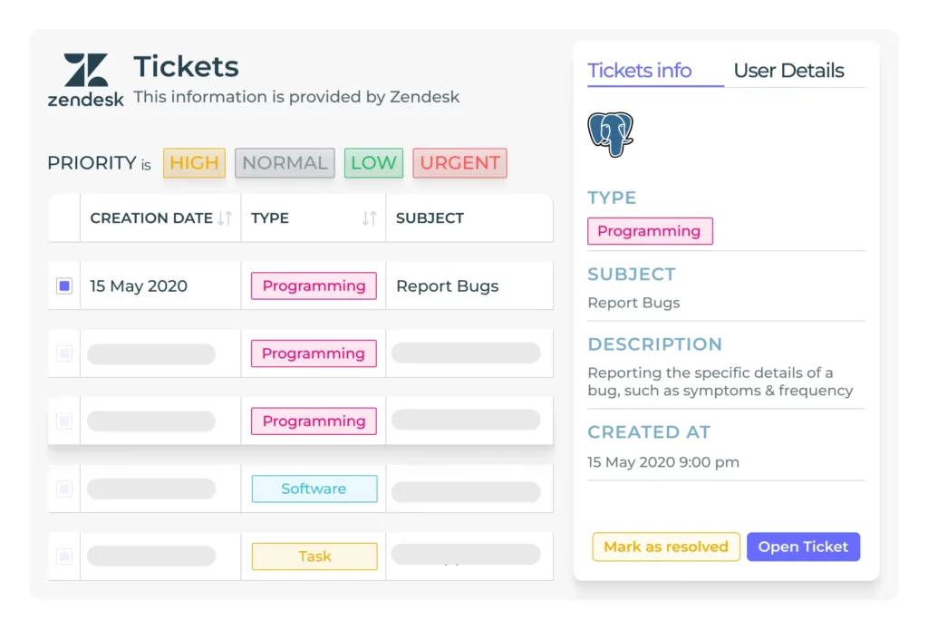
8. Make it interactive
Making table UI design interactive can greatly influence users’ efficiency and usability.
Table UI design can be made more interactive by providing means to
- Edit cells in table
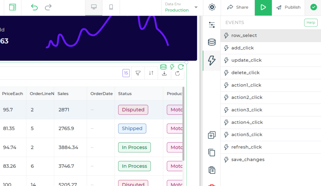
- Adding button in cell rows to perform actions like sending an email, making a call, downloading a PDF and more
- Setting up navigation on events like row click or value change
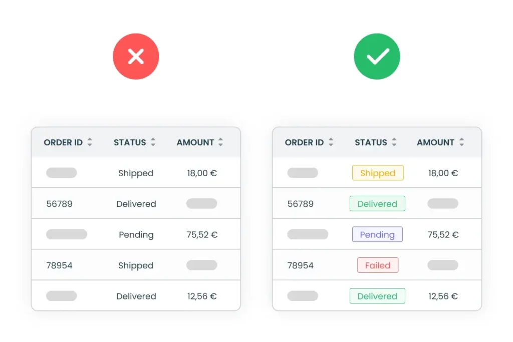
9. Stylize and add branding
It is pretty important to maintain proper visual design and colour schemes throughout the application.
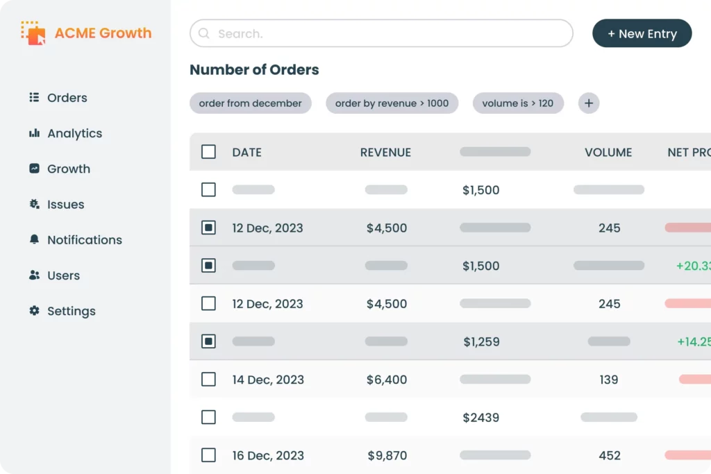
The points to keep in mind:
- There needs to be consistency across all the components
- Use contrasting colours to highlight the important stuff.
- Make sure that the colour contrasts with text.
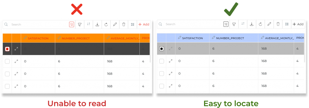
The choice of colours impacts table UI’s wider usability, including with regard to accessibility. Using colours with high contrast helps users, including those with visual impairments, to quickly locate priority information and interactive elements.
Colouring CTAs and highlighting important rows such that it grabs the attention of users, thus making it easy for users to interpret.
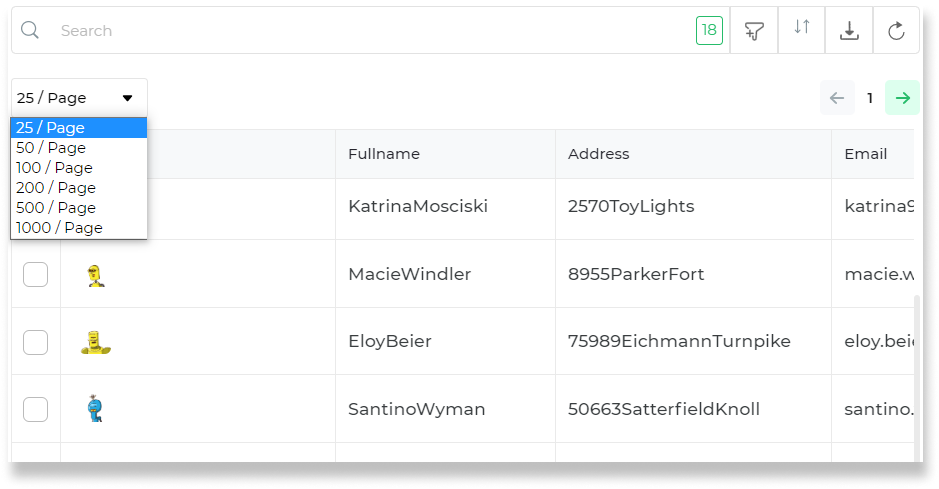
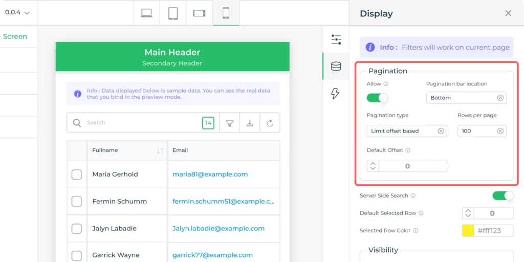
10. Enable pagination
Users can be provided with two choices, that is, either user scrolls through all entries at once or divides the data into different pages aka pagination.
Let’s understand it from two points of view:
- User point of view: When data is small, it becomes easy to scroll through but for large data sets, scrolling might become a hectic task to scan through the data. Pagination can make it easier for users to scroll through displayed data because they only see a small subset of all items at any given time. However, some users prefer to be able to browse through all items. This largely comes down to user preferences.
- Technical point of view: Paging can also provide performance benefits. Obviously, when your UI only needs to display a few items at a time, rather than thousands, it’s technically easier to handle. The best practice is to use pagination for larger data sets to improve performance and scanning easily.
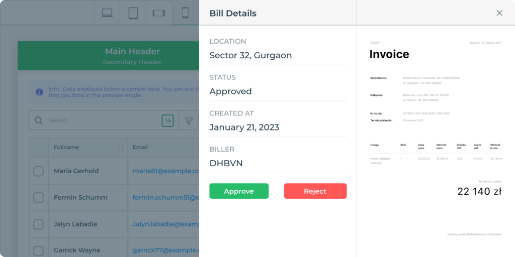
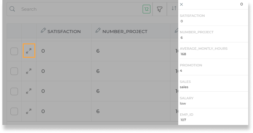
11. Add Accessory Screens – Modal, Pop-ups, Detail View
Firstly, there’s the matter of determining the prominence of tables on a given screen. This involves distinguishing between screens where tables take center stage and those where they play a supporting role.
Certain screens are designed with the primary purpose of enabling users to read data through a prominently displayed table. In contrast, other screens incorporate tables as an additional feature within a more extensive interface.
Take, for instance, the disparity between the home screen of a CRUD (Create, Read, Update, Delete) app, where the table is a central focus, and a summary table nestled within an analytics screen.
Additionally, it’s worth considering whether the table’s objective is solely to present data or if it serves as a gateway for users to access deeper functionalities for individual entries. This might encompass functionalities such as update screens, further drill-downs, or other interactive features. Understanding the role and prominence of tables on various screens is vital for crafting an interface that aligns with user needs and the overall design goals.
Incorporate modal screen, pop up, or detail views for deeper exploration of data, providing additional context without cluttering the main interface.
When the data items inside the table are large and cannot be displayed within the width, the detail view helps in displaying large data items by expanding it.
While using mobile devices it might become impossible to read data like addresses or emails which are sometimes very long. In that case, using a detailed view is the best option.
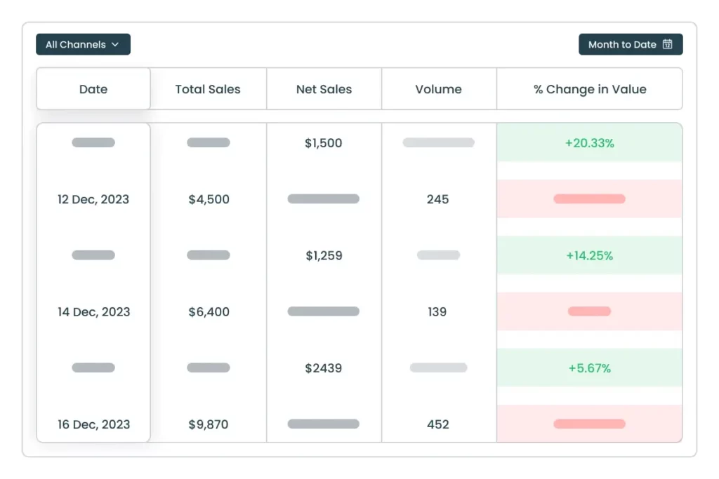
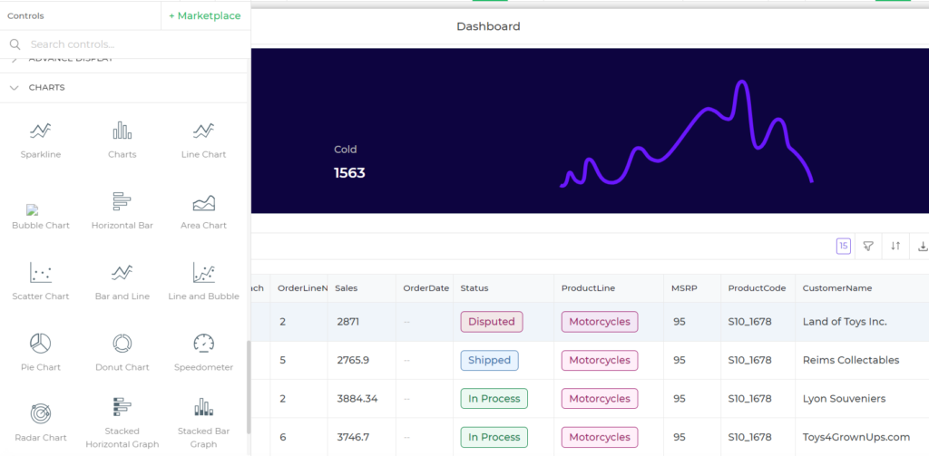
12. Complementary charts and graphs
Enhance data visualization by integrating complementary charts and graphs, providing a holistic understanding of information.
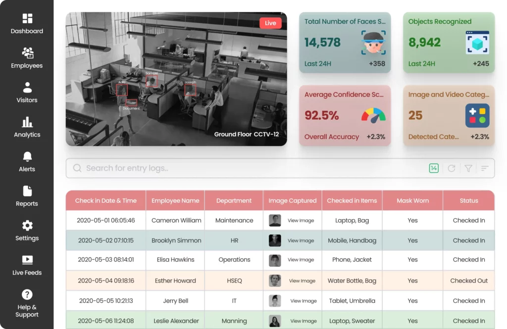
Table UI design is an inclusive activity. That means, any UI component in or around the table should also be thoughtfully designed to further add value to table data.
A common approach app developers take is adding elements like cards (dashboards), chart, graphs, and widgets that represent analytical output derived out of the table data.
Conclusion
Using a good table UI design can greatly influence users’ efficiency and usability. Creating data tables is one of the most repetitive and time-consuming tasks that most developers settle for. But by using low code platforms to make table UI and following the tips discussed above it becomes quite easy to implement.
DronaHQ is a great platform to start experimenting with low code. You can build amazing Table UI design by using built-in controls such as table grid control. With this, you can provide custom action buttons and customize the table grid to make it more interactive.
Related Articles